New Uniforms
- Thread starter SAECATFAN
- Start date
You are using an out of date browser. It may not display this or other websites correctly.
You should upgrade or use an alternative browser.
You should upgrade or use an alternative browser.
Yes, that will be a travesty. Still can't believe they changed the K to an H.

Yes, that will be a travesty. Still can't believe they changed the K to an H.
Odd, I still see a K.
I can tell from here you are in bad need of a visit to the optometrist.Yes, that will be a travesty. Still can't believe they changed the K to an H.
It isn't an H but the way they did it makes it look like a deformed K. I won't be buying anything new with that logo on it. They failed with this marketing.
I bet now that we have painted that checkerboard everywhere, Nike will take it off the uniform. Probably replace it with bunch of duck heads. You know, to represent our history of doing whatever Nike asks us to do.
I bet now that we have painted that checkerboard everywhere, Nike will take it off the uniform. Probably replace it with bunch of duck heads. You know, to represent our history of doing whatever Nike asks us to do.
Would rather have armadillos instead of ducks.
I heard that the reasoning for the K to be like that was for the overall branding and how it is the official university logo now and not just athletics. It's still similar enough that you know who it is. It also makes the K stand out more (even though I like the regular K as you can tell). If you turn it sideways, it forms a Y. All of UK's email addresses are @uky.edu. I was told that was part of the logic in changing up the K.
As for the uniforms, I love the additional colors. Black, silver, grey, whatever looks good. I like the subtle checker board pattern. I would however, like a more traditional looking uniform. I think that less is more. There are a lot of things you can do with a simple uniform to make it sharp. If I had a pencil and paper, I could show you, but I think you get my drift.
As for the uniforms, I love the additional colors. Black, silver, grey, whatever looks good. I like the subtle checker board pattern. I would however, like a more traditional looking uniform. I think that less is more. There are a lot of things you can do with a simple uniform to make it sharp. If I had a pencil and paper, I could show you, but I think you get my drift.
I heard that the reasoning for the K to be like that was for the overall branding and how it is the official university logo now and not just athletics. It's still similar enough that you know who it is. It also makes the K stand out more (even though I like the regular K as you can tell). If you turn it sideways, it forms a Y. All of UK's email addresses are @uky.edu. I was told that was part of the logic in changing up the K.
As for the uniforms, I love the additional colors. Black, silver, grey, whatever looks good. I like the subtle checker board pattern. I would however, like a more traditional looking uniform. I think that less is more. There are a lot of things you can do with a simple uniform to make it sharp. If I had a pencil and paper, I could show you, but I think you get my drift.
I would be fine with simple design. I'd like a nice mix, honestly. Something with a new age flare to it, but not overly designed.
Like the Redball Jets forms years gone byI heard the new unis we'll make a kid run faster and jump higher
Growing up a Penn State fan, I was into a mentality of "change the unis and we will riot and burn down the university." Now as a Kentucky fan, I have learned to love all the variation, silver, gray, black etc. It's very fun.
Of course PSU, Bama, USC, etc. should never do anything weird with their unis.
Of course PSU, Bama, USC, etc. should never do anything weird with their unis.
I agree on the various colors and using the checkerboard pattern of Secretariat's silks. However, I personally wish we would use an all white road uniform especially in warm, humid games in southern states. I understand that's being highly selective. Actually, it doesn't matter what color combination the team uses as long as we cross the goal line more than our opponents.I heard that the reasoning for the K to be like that was for the overall branding and how it is the official university logo now and not just athletics. It's still similar enough that you know who it is. It also makes the K stand out more (even though I like the regular K as you can tell). If you turn it sideways, it forms a Y. All of UK's email addresses are @uky.edu. I was told that was part of the logic in changing up the K.
As for the uniforms, I love the additional colors. Black, silver, grey, whatever looks good. I like the subtle checker board pattern. I would however, like a more traditional looking uniform. I think that less is more. There are a lot of things you can do with a simple uniform to make it sharp. If I had a pencil and paper, I could show you, but I think you get my drift.
Jesus Christ, fact is we're getting new uniforms and they're likely to be unveiled sometime in spring. Curious if anyone had heard anything is all.
What a miserable messageboard to compliment a miserable football program. Get pumped.
What a miserable messageboard to compliment a miserable football program. Get pumped.
Can we please separate ourselves from the horse racing angle!? The whole checkerboard deal is incredibly played out. We need something new and simple, but unique. Perhaps a nice denim uniform????
Can we please separate ourselves from the horse racing angle!? The whole checkerboard deal is incredibly played out. We need something new and simple, but unique. Perhaps a nice denim uniform????
Perhaps not.
Completely kidding. Those and the "Cat Scratch" uniforms from the 93-94 season were two of the worst in Kentucky Basketball history. The throwbacks we wore when Rondo and Sparks were in the backcourt are by far my favorite. I digress; I just want to get away from the horse racing design. It has nothing to do with the football program and with so many upgrades being made I think it is time to wipe the slate clean and get some unique, but simple uniforms. However, I would like to keep all of the new color variations with the possibility of a black helmet.
I want to win first and foremost, but I like speculating on unis. I think it's kinda fun. I bet the players like it more than fans realize.
Looking forward to seeing some new unis. Honestly, I'd like to see a new black helmet.
Something like a matte black helmet with an enlarged, chrome blue UK logo outline (just the outline. leave the inside of the logo itself as matte black) on both sides of the helmet, chrome blue stripe, and chrome blue (or matte black) facemask.
Makes more sense then chrome helmets in a blackout game.
I am fine with the multiple colors, but really wish the design would have a more classic look.
Miss State did things right IMO
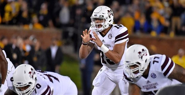

Miss State did things right IMO
I wish they would get rid of the different color sleeves and go with the solid color on the whole jersey