This court is hideous looking

bac2therac

Hall of Famer
Jul 30, 2001
252,654
181,625
113
Wtf..it is hurting my eyes. Why are their different colors along the baseline making it not only distracting but hard to tell where it starts..why would someone come up with a court design like that

 

biazza38

Heisman
Nov 18, 2012
14,667
18,088
81
Agree, and I like Boise state's football field. I don't get the color tone change in the corners. It's confusing and stupid. But hey, everything the NCAA does is in the best interest of the student athlete.
 

Caliknight

Hall of Famer
Sep 21, 2001
198,388
151,114
113
Originally posted by bac2therac:
Wtf..it is hurting my eyes. Why are their different colors along the baseline making it not only distracting but hard to tell where it starts..why would someone come up with a court design like that
Why? Because they can, which is horrible reason to do something. It's like a number of these super busy uniforms designs.

More is usually better, but not always.
 

BoroKnight

All-Conference
Mar 13, 2010
11,091
2,093
0
The colors, the lettering style -- can't really call it a font -- almost as bad as the near-constant overhead shots of Kentucky fans.

Makes me long for the black and blue floors of the earlier rounds ...
 

bac2therac

Hall of Famer
Jul 30, 2001
252,654
181,625
113
The thing is some design team spent months working on the floor design and thought it was awesome. Maybe it looks good from the nosebleeds but I cannot understand what they were going for there
 
The Knight Report

Latest

  1. 01 The Knight Report Basketball Analytical look Rutgers Women's Basketball opening the season with a 31-point win

  2. 02 The Knight Report Join The Knight Report TODAY and get it for 60% off!
  3. 03 The Knight Report The Knight Report - Ask The Experts Chat: November 4th Edition
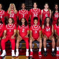
  4. 04 The Knight Report Basketball How to watch Rutgers / La Salle; Pregame Info, More: Gameday Central

  5. 05 The Knight Report Three Rutgers Basketball Commits Ranked Among Nation's Top 150 Prospects