Leveled The Bevel. Texas Tech Identity & Brand Update
Texas Tech revealed numerous new updates to their brand image today, “leveling the bevel” to much praise from the Red Raiders’ fanbase. Robert Giovannetti met with the local media earlier today to discuss the many Texas Tech identity and brand updates.
“We’re excited to, as you saw in the announcement earlier, introduce the new modern flat Double T as our primary mark for Texas Tech Athletics. Beginning in the fall of 2026, it won’t just be the Double T, it will also include our secondary mark, tertiary marks, all of our word marks, as well as Raider Red and the Masked Rider.”
“But in actuality, over 3,000 marks will be impacted by this change. It was years in the making. We conducted focus groups and studies with many Texas Tech fans and stakeholders, and we involved Adidas, LDWW, Torch Creative, and several members of our staff to get to the point where we are today.”
Getting The Design Right
The most recent iteration of the Double T used from 1999-2026 has been one of the most recognizable symbols in college athletics. It was very important to Robert Giovannetti, and the rest of athletic program to get this throwback design right.
“The primary message we got from the focus groups, which included student-athletes, current students, alumni, donors, and members of the Board of Regents was that everyone liked the flat Double T.”
“A lot of people also liked the beveled Double T, but overwhelmingly, people preferred the flat version. We took that feedback, along with input from Adidas on some of the design elements they wanted to incorporate moving forward.”
According to Giovannetti, almost all involved in the LDWW poll were for the change of the athletic identity update.
“It was a minimum of 90% in favor of the change. And, you know, it really wasn’t even presented as “should we change it?”, it was more presented as “what do you think?”.”
Modernizing The Iconic Symbol
As previously mentioned, the bevel Double T has been used since before the start of the 21st century so it was important to modernize the iconic symbol.
“It’s just a little more modernized. If you look at some of the lines, we have a video online where the designer explains the use of space. I’m not a graphic designer, so I can’t really speak knowledgeably about how you use negative space and those types of things.”
“But if you look at the difference in the middle of the Double T, the base, and a few other details, and you put them side by side, you’ll see the differences.”
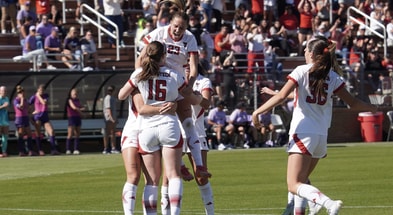
Updated Athletics Uniforms
One of the bigger questions from this announcement was the jersey’s new look. We most likely won’t get an official look at the updated uniforms in question until the spring or summer, but we can speculate the future appearance of the Red Raiders.
“We’ve got a great video out on our social media that gives a behind-the-scenes look at how this all came together. The Adidas designers talk quite a bit about their ideas for the flat Double T and how to incorporate it into the uniforms.”
“People will ask, “Why are you announcing it now but rolling it out in 2026?” Well, there’s a lot that goes into uniforms, facilities, and retailers. We felt like homecoming would be a good week to share the news, but we also need to give retailers and licensees time to prepare their inventory and get ready for next year.”
“Again, one thing we noticed was that there really wasn’t a lot of negativity toward anything. The flat Double T, which I’ve got right here, just really resonates with a lot of what we represent.”
Differentiating From The University’s Emblem
Announced in the press release earlier by the University, it reported that this logo change would be only for the Athletics side. This is pretty common according to Giovannetti as he reiterated the press release’s message.
‘I think it was just something the university really liked remaining with the Double T. You see a lot of campuses do that; there’s an athletics mark and then a campus mark.”
“We have a great partnership with media and communications on campus. President Schovanec has been involved in this from the beginning. When Adidas came to present various versions of the Double T logo, we actually had the meeting in the President’s conference room with his team there as well, so everyone was aware of what was going on.”
“They felt like, for them, they wanted to keep using the beveled Double T. And again, we’ve had a lot of success in athletics with that version too. As Joey McGuire said to me this morning, “Any Double T is a great Double T.” We just felt there was a good reason to differentiate and have this one represent us.”
Why Update The USA Court Now?
A few weeks ago posts came out on social media from many different users showing an image of a new United Supermarkets Arena court with the updated logo. Many assumed it would be an USA court only logo, but as the release shows today that is not the case.
“Yeah, these things take a long time. It takes a while to make all the changes. If you go through the football training facility, you’ll notice we’d already made the updates there because we knew the change was coming.”
“We also had to redo the floor at the arena this year, so we felt like now was as good a time as any to make that change.”
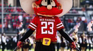
Raider Red’s Emblem
In a graphic released earlier showing all the new emblems a Raider Red sport-specific logo was unveiled. This will be available to all athletic programs on campus
“Raider Red is participating in all of our sports, and you’ll see specific Raider Red marks for each of our individual teams. We involved Stephanie, Bruce, and Aaron from Spirit, as well as members from campus, so they had a lot of input on how Red looks and how he’ll be represented.”
Join the conversation with other Red Raiders on the Inside The Double T forum.
Subscribe today to get the most in-depth Texas Tech sports and recruiting coverage.
Follow us on X: @RedRaiderSports
Like and follow us on Instagram @rrs_rivals & like us on Facebook.