
Those are pretty sweet. Would look nice with the white helmet and red block R.
Would instantly be my favorite uni.
Noooooooo!! White helmets look like garbage.
Those are pretty sweet. Would look nice with the white helmet and red block R.
Would instantly be my favorite uni.
perfect!

The home Reds are quite embarrassing, you are in the huge minority here.They aren't Salmon. Or even close to it. And I like them a lot. They are awesome.
You want these uniforms back.
Credit: Lawrence Gettleman, RU 62'
Agree that they are not traditional red. They are a different shade of red, called scarlet.I actually agree with you that they aren't actually salmon. I think it's just more of a joke because they aren't are traditional red. They're some other hideous shade of red.
They aren't scarlet. Not even close. Closer to salmon then scarlet.Agree that they are not traditional red. They are a different shade of red, called scarlet.
The 2006 uniforms were red. In 2008 we switched to scarlet, which is noticeably lighter than the 2006 red. Generally scarlet is three parts red and one part orange. I don't know if RU scarlet is in exactly that proportion, but you get the idea.
Then in 2012, as everyone knows, we switched to the combat unis. The color of the home jerseys is indistinguishable from that of its predecessor. Hold the two together and tell me if you can see a difference. Bet you can't.
You want these uniforms back.
Credit: Lawrence Gettleman, RU 62'
Rutgers red or version of scarlet is officially Pantone 186.

Agree that they are not traditional red. They are a different shade of red, called scarlet.
The 2006 uniforms were red. In 2008 we switched to scarlet, which is noticeably lighter than the 2006 red. Generally scarlet is three parts red and one part orange. I don't know if RU scarlet is in exactly that proportion, but you get the idea.
Then in 2012, as everyone knows, we switched to the combat unis. The color of the home jerseys is indistinguishable from that of its predecessor. Hold the two together and tell me if you can see a difference. Bet you can't.

Who cares, it looks pink...not concerned with the reasons, just the reality.Rutgers red or version of scarlet is officially Pantone 186.

Rutgers red or version of scarlet is officially Pantone 186.


What ? No polka dots?Those are the Colts' unis in red & very similar to Wisconsin's unis. Need black & grey/silver in them & use the current sword # font & sword stripe down the leg.
Keep the silver battlescarred helmets as the primary helmet & use the white helmets like we do now.
You like them, and the names and numerals as well?If you think it looks pink or salmon you need your eyes checked.
You like them, and the names and numerals as well?

interesting how this thread pre-dates Chris Ash, yet the look perfectly fits his no-nonsense style....
and the OP added in a post later in the thread that the helmet was red with white R and a black stripe.....the black stripe also lines up with what Ash has done this spring (even though the goal is for players to get it removed)
I thought that this design stood out as very modern, yet traditional, because there's no outline on the numbers.
I wish it said Rutgers at the collar, but then it wouldn't be a throwback
Where do these mock ups come from?
A friend of mine who works at Nike sent me these. They were based on a throwback uni I believe. That being said I don't know if the plan is to use these for next year, but I love them.
And add swords on the helmets instead of OSU weed plants?
Too confoluted for me. Just swords would work- Swords as attaboy stickers for offensive plays
- Shields as attaboy stickers for offensive plays
- Medieval flails as attaboy stickers for offensive plays

interesting how this thread pre-dates Chris Ash, yet the look perfectly fits his no-nonsense style....
and the OP added in a post later in the thread that the helmet was red with white R and a black stripe.....the black stripe also lines up with what Ash has done this spring (even though the goal is for players to get it removed)
I thought that this design stood out as very modern, yet traditional, because there's no outline on the numbers.
I wish it said Rutgers at the collar, but then it wouldn't be a throwback
ALMOST perfect. The font and Block R need to be fixed.
I'm somewhat partial to this, assuming the lettering is fixed, the knighthead is removed, and the Block R is put in rather than the defunct script R. Reverse the pants sword logo so it's facing down too. https://rutgers.forums.rivals.com/threads/rutgers-concept-uniforms.61115/
Love these!interesting how this thread pre-dates Chris Ash, yet the look perfectly fits his no-nonsense style....
and the OP added in a post later in the thread that the helmet was red with white R and a black stripe.....the black stripe also lines up with what Ash has done this spring (even though the goal is for players to get it removed)
I thought that this design stood out as very modern, yet traditional, because there's no outline on the numbers.
I wish it said Rutgers at the collar, but then it wouldn't be a throwback

Those are too stale & similar to Nebraska, Wisc, Colts, Ole Miss, etc. We need to at least have black in the unis if we're ditching grey/silver. Pants should have striping.interesting how this thread pre-dates Chris Ash, yet the look perfectly fits his no-nonsense style....
and the OP added in a post later in the thread that the helmet was red with white R and a black stripe.....the black stripe also lines up with what Ash has done this spring (even though the goal is for players to get it removed)
I thought that this design stood out as very modern, yet traditional, because there's no outline on the numbers.
I wish it said Rutgers at the collar, but then it wouldn't be a throwback

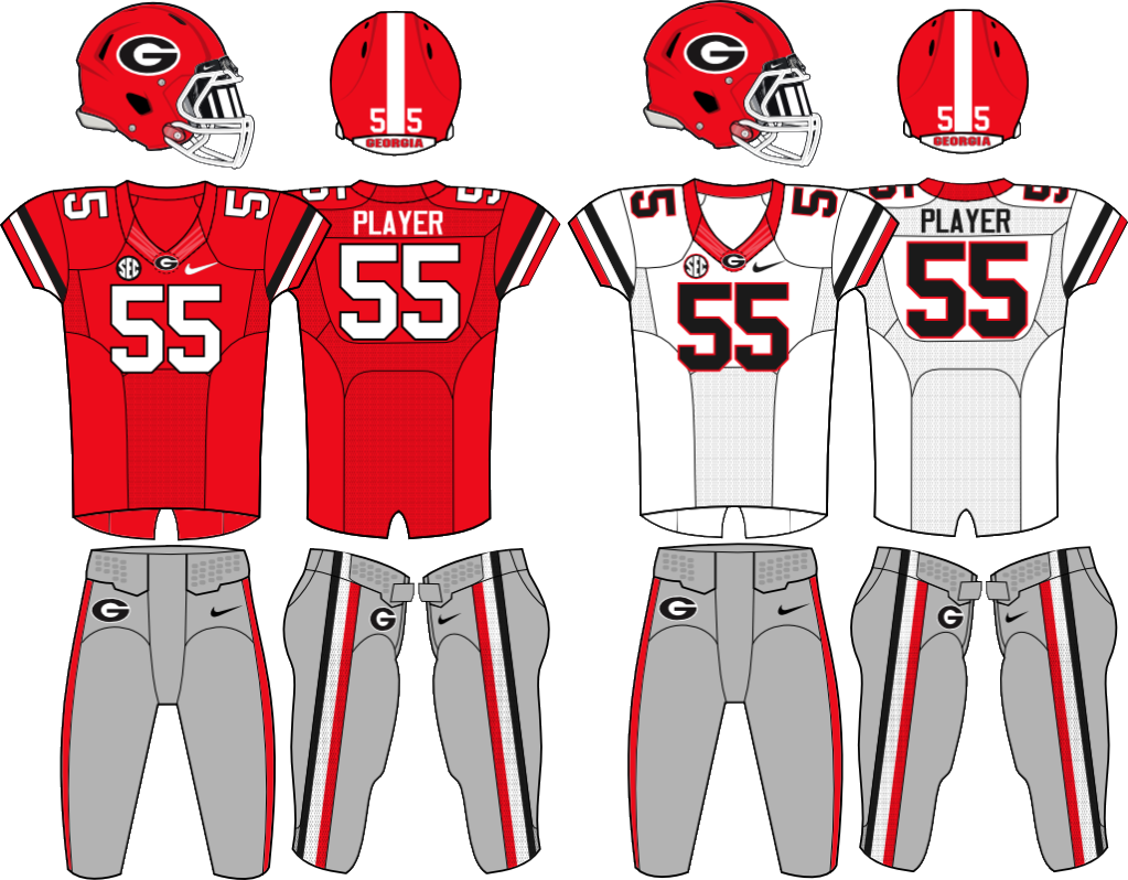
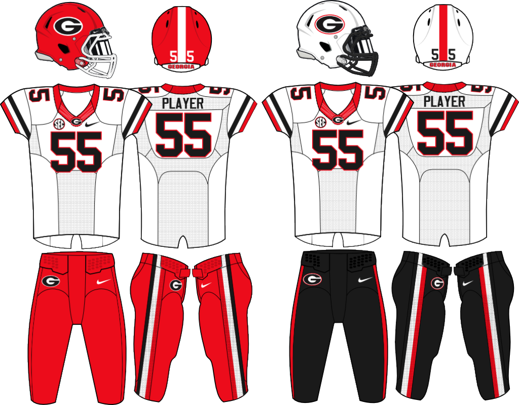
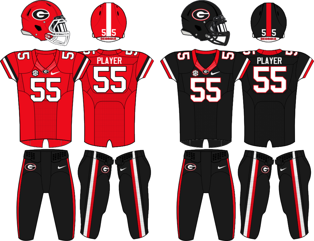
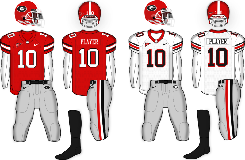

Like someone said.. these are the COLTS uniforms. Someone just photoshopped them to change from blue to red.Thoughts?
http://[URL=http://s222.photobucket.com/user/ouchmyknee/media/RU_2016_zpsneormelh.jpg.html][IMG]http://i222.photobucket.com/albums/dd309/ouchmyknee/RU_2016_zpsneormelh.jpg
 The Knight Report
2026 Rutgers Football Season Predictions
The Knight Report
2026 Rutgers Football Season Predictions
 The Knight Report
Rutgers Baseball Transfer Portal Profile: OF Gavin Greger
The Knight Report
Rutgers Baseball Transfer Portal Profile: OF Gavin Greger
 The Knight Report
Rutgers Football Top 10 Countdown: Kobe Asamoah
The Knight Report
Rutgers Football Top 10 Countdown: Kobe Asamoah
 The Knight Report
Rutgers Football Season Preview Extravaganza: Part One - Offense
The Knight Report
Rutgers Football Season Preview Extravaganza: Part One - Offense
 The Knight Report
2026 Rutgers Football Watch Party Locations
The Knight Report
2026 Rutgers Football Watch Party Locations