We have generally learned that there's not much utility in fact-checking every tweet that springs to life from the imagination of Donald Trump or which receives his blessing via retweet. Tweets containing factual errors are not as plentiful as those containing exclamation points or disparagement, but they aren't exactly rare.
But on Thursday evening, Trump retweeted this one, and we -- well, I -- couldn't let it stand.
View image on Twitter
Follow
 Donald J. Trump
✔@realDonaldTrump
"@TaylorEdwards99: THIS IS @POTUS'S LEGACY! AN ABSOLUTE DISASTER!!! WE NEED @realDonaldTrumpNOW!! #MAGA #TRUMP2016
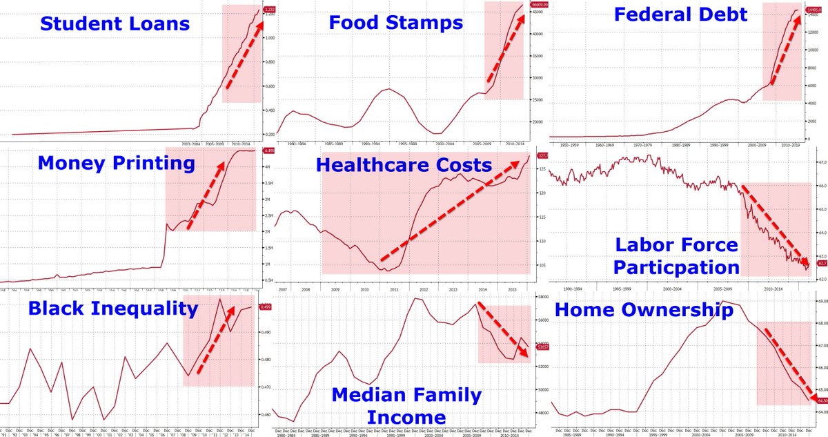
There are nine little graphs embedded in there, with hard-to-read axes and unclear provenance for the numbers, all of which are meant to bolster one argument: Barack Obama's presidency has been bad.
Look, for example, at the graph at upper left, "Student Loans." It's almost impossible to make out the labels on the horizontal axis, but it's clear that there simply aren't any until the graph starts to rise. Which is ... a bit deceptive. So what I figured I'd do is try my best to recreate these charts with verifiable numbers, to see how this argument stacks up....
https://www.washingtonpost.com/news...ne-graph-tweet-proving-that-obama-has-failed/
But on Thursday evening, Trump retweeted this one, and we -- well, I -- couldn't let it stand.
View image on Twitter
Follow
Donald J. Trump ✔@realDonaldTrump
"@TaylorEdwards99: THIS IS @POTUS'S LEGACY! AN ABSOLUTE DISASTER!!! WE NEED @realDonaldTrumpNOW!! #MAGA #TRUMP2016
There are nine little graphs embedded in there, with hard-to-read axes and unclear provenance for the numbers, all of which are meant to bolster one argument: Barack Obama's presidency has been bad.
Look, for example, at the graph at upper left, "Student Loans." It's almost impossible to make out the labels on the horizontal axis, but it's clear that there simply aren't any until the graph starts to rise. Which is ... a bit deceptive. So what I figured I'd do is try my best to recreate these charts with verifiable numbers, to see how this argument stacks up....
https://www.washingtonpost.com/news...ne-graph-tweet-proving-that-obama-has-failed/