Keep the new helmet decals
- Thread starter bulldoghair
- Start date
You are using an out of date browser. It may not display this or other websites correctly.
You should upgrade or use an alternative browser.
You should upgrade or use an alternative browser.

My only observation is that the logo should have been bigger. It looked small and out of scale on the helmet.
Agree. Needs some outline of some kind too. Then it's good.
The mState is a superior logo design and should remain our primary logo.
That’s enough Mr. Templeton, now go back to bed.
The mState is a superior logo design and should remain our primary logo.
Shut your dirty 17ing mouth!

The mState is a superior logo design and should remain our primary logo.
balderdash!! Coasttrash
Last edited:

The mState is a superior logo design and should remain our primary logo.
you mean mSTA TE? **** is off center and trash. trash
It looked really cool on the helmet. Way better than the banner m. In fact, I hate the banner M. I’m just not sure if I want this logo used for any sport besides baseball. Football needs the return of interlocking MSU. That would be ideal.
The mState is a superior logo design and should remain our primary logo.
Agreed. MState is on every building, sidewalk, door, wall etc on campus. It's here to stay.
Agreed. MState is on every building, sidewalk, door, wall etc on campus. It's here to stay.
The script “A” is on every building, sidewalk, door, parking sign, etc. on Alabama’s campus. But it’s not on their football helmets. Same with Florida’s logo, which isn’t the cursive “Gators”, LSU’s logo, and many others. Just because M-State is the primary logo doesn’t mean that’s what has to be on the football helmets.
Agreed. MState is on every building, sidewalk, door, wall etc on campus. It's here to stay.
It is on the academic side of things. It's about to be gone in athletics. Praise the lord!
Last edited:
It is on the academic side of things. It's about to be gone in athletics. Praise the lord!
About to be gone? I don't know about that. Did you notice that logo at midfield last night?
The University has a lot invested in that brand, and it is staying for a while. Athletics is one of the primary avenues of promotion. Doesn’t have to be on the helmets, though.

It looked really cool on the helmet. Way better than the banner m. In fact, I hate the banner M. I’m just not sure if I want this logo used for any sport besides baseball. Football needs the return of interlocking MSU. That would be ideal.
That is for baseball....except this special occasion.
It actually looks better than anything else we have...but it is baseball's domain.
Only cap I have worn for 40 years...so like it.... but it is for baseball.
Just my opinion....
Last edited:
I just want to win. The energy spent on debating opinions of uniform aesthetics seems ancillary to our main goal of recruiting and contributions to Bulldog Club.
Agreed. MState is on every building, sidewalk, door, wall etc on campus. It's here to stay.
That's fine. It doesn't have to be on our helmet though.
I just want to win. The energy spent on debating opinions of uniform aesthetics seems ancillary to our main goal of recruiting and contributions to Bulldog Club.
“Adam Gorney, a national recruiting analyst for Rivals, one of the top recruiting analysis sites, has been looking at the recruiting process both before and after the advent of these uniform changes. Uniforms have a substantial effect on recruits choosing which program to play for, he said.”
Source of quote - https://cronkitenews.azpbs.org/2020/01/02/college-football-uniforms/
Additional supporting source - https://www.espn.com/college-sports...all-recruiting-uniforms-selling-point-schools
Latest
-
01
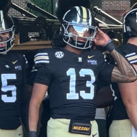 Maroon and White
Mississippi State Week 4 Preview: Mizzou Q&A
Maroon and White
Mississippi State Week 4 Preview: Mizzou Q&A
-
02
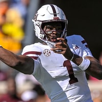 On3 Football
Mississippi State AD: 'We're going to be as competitive as we need to be' to keep QB Kamario Taylor
On3 Football
Mississippi State AD: 'We're going to be as competitive as we need to be' to keep QB Kamario Taylor
-
03
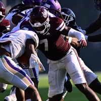 Maroon and White
Mississippi State Week 4 Availability report
Maroon and White
Mississippi State Week 4 Availability report
-
04
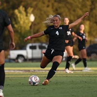 Maroon and White
Mississippi State Soccer looks to stay unbeaten in SEC play with No. 9 Vols trip
Maroon and White
Mississippi State Soccer looks to stay unbeaten in SEC play with No. 9 Vols trip
-
05
 Maroon and White Football
Fluff Bothwell a "huge part" of Mississippi State's offensive success
Maroon and White Football
Fluff Bothwell a "huge part" of Mississippi State's offensive success