UK helmets
- Thread starter screwduke
- Start date
You are using an out of date browser. It may not display this or other websites correctly.
You should upgrade or use an alternative browser.
You should upgrade or use an alternative browser.
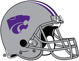
Sorry but it looks like Kansas State. Not a fan of the new, old logo. This is a Kansas State Google image btw.
Sorry but it looks like Kansas State. Not a fan of the new, old logo. This is a Kansas State Google image btw.
I disagree. But, if your mascot is a wildcat, your logo might be similar to other teams with the same mascot.

The only thing that would make the new logo better would be if it had a fierce chicken claw attached.
I'm a lifelong Vol fan and I think your new logo looks fantastic. The helmets look sharp. Just an outside opinion.
Sorry but it looks like Kansas State. Not a fan of the new, old logo. This is a Kansas State Google image btw.

Yup they look identical.... [eyeroll]
The K State cat logo has a level haircut in the back, it appears to only have 2 short teeth, it is purple & it looks fairly tame. Our cat logo has it's hair blowing in the wind, it has 4 long teeth, it is blue & it appears to have a vicious expression. I like the UK cat a whole lot better, especially on that black helmet.
Yup they look identical.... [eyeroll]
Now that I am observing them side by side from a perspective of one foot away I can see that one has two teeth and the other has four. I bet the two logos will look even more different from a tv camera or fans view from the stands a 100 feet away. At least both schools dont share a K in their name as well.
I don't see two birds humping. What are you talking about? Looks awesome!!!!
Another close cousin.
I would assume that this logo is a snapping turtle before I would a cat, if I didn't already know that they're the Cougars.
I disagree. But, if your mascot is a wildcat, your logo might be similar to other teams with the same mascot.
Crazy how that works, isn't it?
I hope this is a passing phase because it's not getting any better looking days later.
^The K State cat logo has a level haircut in the back, it appears to only have 2 short teeth, it is purple & it looks fairly tame. Our cat logo has it's hair blowing in the wind, it has 4 long teeth, it is blue & it appears to have a vicious expression. I like the UK cat a whole lot better, especially on that black helmet.
This
I can't stop seeing two birds screwing. God I hate this logo. It's just as bad as the new UK logo. It's like they had a local high school have a drawing contest for a new cat and UK logo. It's pathetic.
After seeing the humping birds and staple puller, I have a hard time looking past those and even seeing the wildcat. I hope the sales are so bad that they are forced to change it back or to something more similar to the previous logos.
Last edited:
I actually like this helmet. [cheers]
Yup they look identical.... [eyeroll]

Haters hate, It's called change, it's a marketing ploy to adjust to what attracts the kids. We are not bama, we have no football tradition. Didn't hear anyone complain about the changes to commonwealth, heard everyone ***** when the Rupp Renovation was shot down. Yes, it's your Opinion, but good lord some of you need a life.
I like it and I think it's better than all of the other "cat logos" that I've seen from other schools.
Yup they look identical.... [eyeroll]
I love it, that helmet looks badass. I'd still prefer the Power K, but this is pretty good to me.
Right there with you. That thing is killer.I actually like this helmet. [cheers]
I can't stop seeing two birds screwing. God I hate this logo. It's just as bad as the new UK logo. It's like they had a local high school have a drawing contest for a new cat and UK logo. It's pathetic.
Sure hope they don't put it like that on the helmet..............[winking]