
SEC Football Uniform Power Rankings: Part II

Anyone who knows me and my weird sports habits will tell you I’m kind of obsessed about uniforms and logos. I analyze critique, bash and appreciate all the little things in a jersey. When I saw Uni-Watch do their countdown of all 122 uniforms in the four major American professional sports recently, it made me go for my own rankings in SEC football. Lists are always great but even better for this year, because several schools have fresh looks for the coming season, including our two new friends from the west.
The rules of the Power Rankings are simple: It’s all opinion-based. The rankings consider school colors, how they utilize them, uniform elements such as an old school classic look as well as new-age designs are measured and each valued equally for what they bring to the team and overall look, as well as small bonus items like a nice helmet or extreme detail will bump teams up, or down if they do it wrong..
This is part two of the SEC Football Uniform Power Rankings: Nos. 7 thru 1. If you missed part one of the Power Rankings, check them out before going on to the top half.
**************

No. 7 Auburn: Auburn is just a timeless SEC look. The old school vertical triple-stripe down the pants, and horizontal across the shoulder, along with the big block numbers make Auburn easy to like, because they don’t do anything too wild. The blue and orange color scheme isn’t always easy to work with, but the Tigers pull it off well. Their attempt to get crazy with alternate orange tops is a nice attempt, and they look fine while reminding me a lot of the Chicago Bears. But just wearing orange as an alternate is pretty ho-hum for this day and age.

No. 6 Vanderbilt: The Commodores are fresh off a complete and much-needed uniform revamp. The old uniforms were outdated and didn’t fit with the program James Franklin is trying to build. The new design is edgy with plenty of black that the kids love, and the all-white (with a white helmet) will make for a great whiteout promotion the fans can get around. The only thing holding the ‘Dores back is the black shoulders on the gold top – which is a huge mistake. Not a good flow there. Overall, a great upgrade from what was a bland design, but still could be much better.

No. 5 Alabama: The Crimson Tide has been wearing these Nike Pro Combat uniforms for a few seasons now, and they look very sharp. It is classic and refined. Hard to beat another timeless look with the numbers on the helmet; Alabama pulls it off very well. Not much to say about these unis because there is not much to them. This is a solid Crimson Tide tradition that should and will never be significantly altered. Many people love this design, but Alabama doesn’t rank any higher than No. 5 because of the lack of uniform design elements.

No. 4 Florida: The triple stripe theme continues down the pants and across the shoulders. The uniqueness of the “Gators” script on the helmet is iconic, and the blue on orange is bold and intimidating, especially in bowels of The Swamp. Take a tip: the Nike Pro Combats Florida wore back in 2009 are fantastic, and they should really take elements from this in a tweak, or just reuse the uniform again. And the all-white alternates with the alternate-logo helmet is a great look too (ignore the model, please). My only suggestion for Florida is to just never ever do this again. Overall, Florida is the highest-ranked “classic look.”

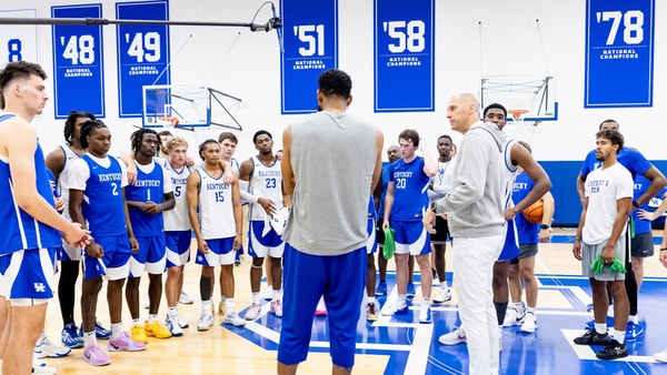
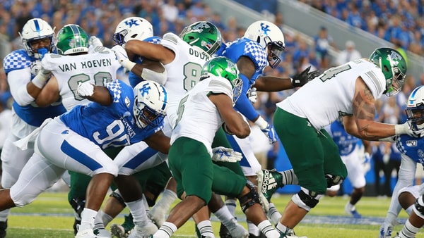
No. 3 Kentucky: Here is our Cats, and we already know they have some really nice uniforms with a lot of combinations of black, white and blue. What’s more is the new look tied the basketball uniform and the football uniform together in a way most other schools can’t compare. The checkerboard design is a really unique pattern that is pronounced enough to be eye-catching, but not overly obnoxious. Nike used the perfect amount to not go overboard while giving a really unique look just for Kentucky: a new-age look while having an old school feel. The alternate blacks and white helmets is an excellent recruiting tool for the coaching staff, and as you know, look great on the field.
Top 10
- 1New
Calipari is in Lexington
Former coach returns for KAT's HoF induction.
- 2
UK-EMU PRIMER
Everything you need to know before Saturday's game.
- 3Hot
KAT's Here!
It's Hall of Fame weekend for Karl-Anthony Towns.
- 4
Staff Predictions
KSR crew picks UK vs. Eastern Michigan
- 5
Dwight Perry
Wofford fires former Cat after NCAA Tournament run
Get the Daily On3 Newsletter in your inbox every morning
By clicking "Subscribe to Newsletter", I agree to On3's Privacy Notice, Terms, and use of my personal information described therein.

No. 2 Arkansas: Nike owns the top five by a mile, and here for Arkansas who will have a completely new look this season. It is probably a good thing coming off the Bobby Petrino fiasco; now is the time for change in more ways than one. The new uniforms are exactly what recruits want: all-black and all-white alternates, and for the coaches, the perfect scheme to get the focus of the program back on the football field. The Razorback logo looks great on the helmet, and they didn’t skimp on the detail all around either. The hog emblem on the front, the fade in the numbers, and the trim on the shoulders are the little things which complete this design. Bonus points for the alternate white helmet with the white logo as well. Overall Arkansas will have one of the nicest combinations of uniforms of anyone in the nation.

No. 1 Missouri: Awesome, awesome, awesome. Did I mention awesome? The conference realignment brought a new and exciting design to the Missouri Tigers football team, and it looks absolutely fantastic. Leave it to Nike to come up with some of the best looking uniforms in the country. Black and yellow, all while or all black, it doesn’t matter. The Mizzou unis will look ferocious on the field no matter what. As for the black shoulders on the road whites, this is how it’s done. (Compare this to Vandy’s black shoulders and you’ll see the difference.) Get a close up on the alternate helmets which are a unique variation on the traditional Tiger logo. Oh, and don’t even get me started on how nice their new basketball uniforms are, either. Those black tops are sick.
**************
The countdown is complete. The top four, Missouri, Arkansas, Kentucky and Florida were all a close call. Their new uniforms are very sharp and it’s truly a toss-up for which is best. I gave the nod to the Razorbacks and Tigers just because of the newness factor. Kentucky will be entering their second season with the “new” design — and while it is a great look — isn’t as fresh as the other guys.
Where did I go wrong? Did I value a team too highly or too critically? What is the worst uniform in the SEC in your opinion? What is the best? If you missed part one where I ranked the bottom half of the league, be sure to check it out too.


Discuss This Article
Comments have moved.
Join the conversation and talk about this article and all things Kentucky Sports in the new KSR Message Board.
KSBoard