Vanderbilt launches "refreshed visual identity" certain to fix athletic woes
Vanderbilt football finished the 2021 season with a 2-10 final record, good for last in the SEC. The men’s basketball team finished with a 15-15 record in the regular season, 7-11 in the conference. The women’s team entered postseason play with a record of 13-17 overall and 4-12 in the SEC. Baseball is the school’s most dominant sport, earning five College World Series appearances since 2011. Overall, though, the athletics department as a whole isn’t too pretty, especially in the top revenue sports.
Vanderbilt’s solution to fixing its top-to-bottom issues? A rebranding, of course!
The school announced a “refreshed visual identity” on Tuesday, one that would “reflect our forward momentum and to build pride and visibility across the institution and athletics program.”
As one could expect, the rollout is riveting stuff. Truly edge-of-your-seat material. I personally found myself searching for an ink pen to sign my non-existent scholarship papers to Vanderbilt after watching this two-minute video alone.
The black-and-white intro you’d hear in a sophomore history class is now a recruiting tool used to bring in high-profile athletes to the school. That’s the move for the Commodores.
“All great institutions have a clear sense of themselves. As we prepare to celebrate our 150th anniversary next year, it’s time for Vanderbilt to sharpen our expression of who we are and what makes us unique. As we look ahead, we believe that a strong sense of self will direct and accelerate our growth and evolution,” Chancellor Daniel Diermeier said in a statement. “This new visual identity is designed to help build and share the pride in our collaborative community and to bring greater visibility to our university across the country and around the world.”
The new wordmarks and logos came after 500 completed surveys, 70-plus one-on-one interviews and dozens of workshops and group engagement sessions over a two-year period.
“Our ‘One Vanderbilt’ spirit defines who we are, and we wanted our identity to reflect that,” vice chancellor for communications and marketing Steve Ertel added. “We heard from individuals across the university that they wanted our marks to signify who we are today, and that they also wanted to demonstrate stronger unity between the university and athletics. The symbols we use to express who we are as a community help us convey a shared sense of purpose that can guide and inspire us while also attracting others to join and support that shared purpose.”
500 surveys. 70 one-on-ones. Dozens of workshops. All for new logos in hopes of bringing forth a “refreshed visual identity.”
The results? You be the judge.
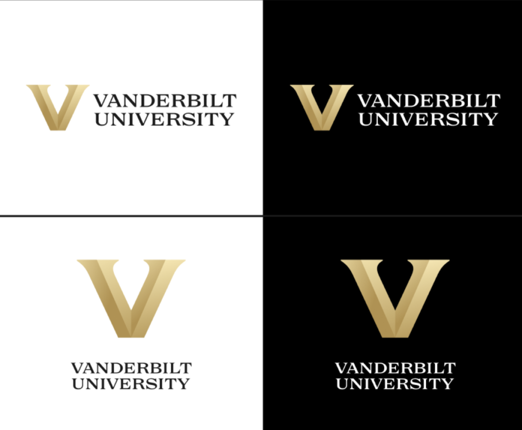
First up, the official school marks and logos:
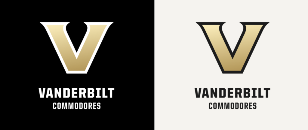
As for Vanderbilt Athletics, a bolded V will be used to represent the Commodores. “This variation aligns to the proportions of the V we use for the university, a visual representation of our One Vanderbilt spirit,” the school says.
Check out the new logos below:
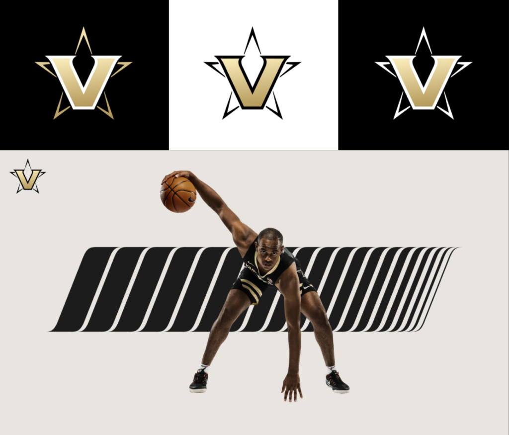
The Star V has long been Vanderbilt’s trademark logo for jerseys and merchandise — the school’s “spirit mark,” they say. That, too, has been redesigned, this time with five distinct Vs forming a star shape surrounding the main logo.
Interesting strategy, one the school seems pretty confident about.
“It’s time for a refresh and we can’t be afraid of that,” Vanderbilt vice chancellor and athletic director Candice Storey Lee added. “I’m so excited.”
We’ll see if it pays off for the Commodores.



Discuss This Article
Comments have moved.
Join the conversation and talk about this article and all things Kentucky Sports in the new KSR Message Board.
KSBoard