And here they are: Uniform thread
- Thread starter Shamoan
- Start date
You are using an out of date browser. It may not display this or other websites correctly.
You should upgrade or use an alternative browser.
You should upgrade or use an alternative browser.


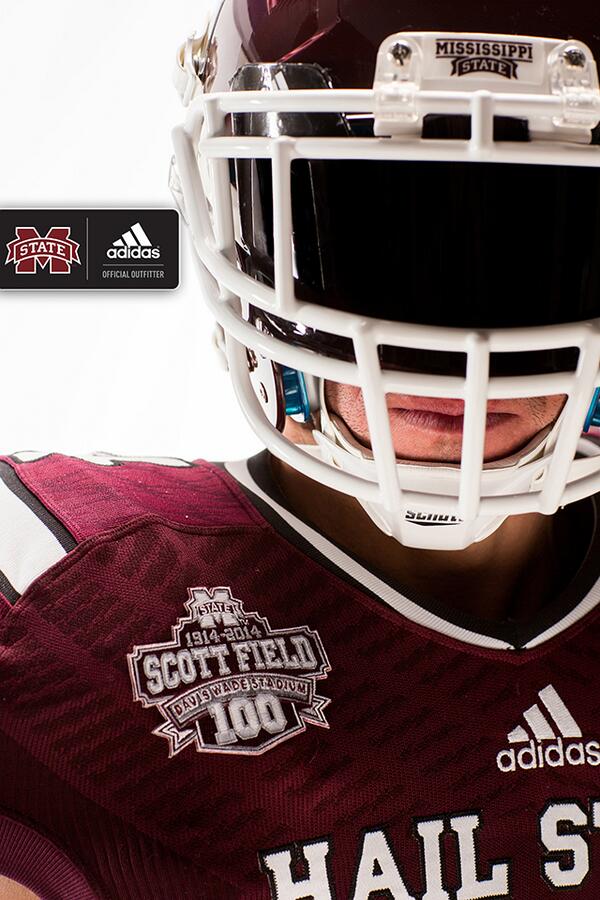


Will it actually have BULLDOGS on the back or the player's name. The Bulldogs across the back looks terrible. As well as the logo on the pants.
did they photoshop the right hand on in the first picture?
It looks too small or something, it just doesn't fit.
It looks too small or something, it just doesn't fit.
Ya'll literally ***** about every single thing our university does. They actually look bad *** and it is cool to go back to the 90's with the look. And the 7 year deal with adidas is also extremely good for the school. The previous deal was "GEAR ONLY" while this new deal has "A significant amount of gear AND CASH." Geez, be happy for your damn school for once.
Questions:
Are these unis only for game 1 celebrating 100 years of DWS??
What unis will be worn in game 2? Same from last year?
Are these unis only for game 1 celebrating 100 years of DWS??
What unis will be worn in game 2? Same from last year?
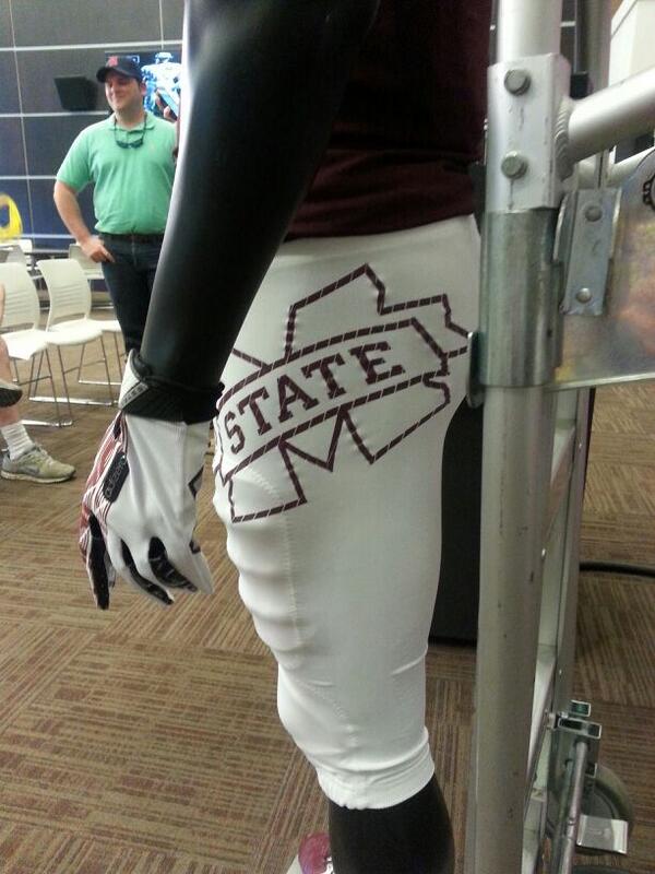
ok, maybe one of yall that was at the presser can clear this up. why were there a slew of pictures taken in pants with no terrible m on them then they unveiled some today with the m on them? perhaps the terrible m ones and combo walmart "bulldogs" jersey are the "one time" uniform for the usm game. and the plain white pants are our regular season unis.....i might be reaching, but im hoping this is the thought process.
I don't know what you think you saw Shamoan but every picture I have seen of the uniforms, in person, and online have had the M-state on the pants.
There's hope!!!!!!ok, maybe one of yall that was at the presser can clear this up. why were there a slew of pictures taken in pants with no terrible m on them then they unveiled some today with the m on them? perhaps the terrible m ones and combo walmart "bulldogs" jersey are the "one time" uniform for the usm game. and the plain white pants are our regular season unis.....i might be reaching, but im hoping this is the thought process.
I'm pretty sure the press release about the new deal with Adidas said that the uniform revealed today was for the USM game only. Baseball got a one time uniform for this weekend as well. Not sure about the differences. There doesn't seem to be a Big M on the pants on the first few pics released.
Last edited:
do you like the walmart-ish "bulldogs" on the name plate and the horrendous giant diagonal m on the hip?
if you say yes, i dont believe you OR you are probably walking around with your t-shirt tucked in to your jorts.
its an improvement, but these could have been awesome had they not made a few poor design choices. im just as sick of bitching as you are with hearing the bitching. dammit, i just want to get classic uniforms without all the silly ******** that 17es it up. take away the m state outline on the hip and i really like them, take away the crappy bulldog lettering and i love them, take away the hail state and substitute miss state (hail state > mississippi state banner, so thank goodness the adidas design monkeys didnt go that route), and they are arguably the best uniform we have ever had. the little things really make a difference.
i love the bones of the uniform (particularly the stripes and general layout), but how great is the mona lisa if you paint a mustache on her? kinda ruins it doesnt it? could have been a 9/10, maybe better, but i give them a 7/10. for reference, i would give last years a 5/10, so if you are looking for something positive, its getting better, but we aint there yet.
and no, i dont want to look like alabama. i want something unique to us, but unique doesnt require adding details that bring down the look.
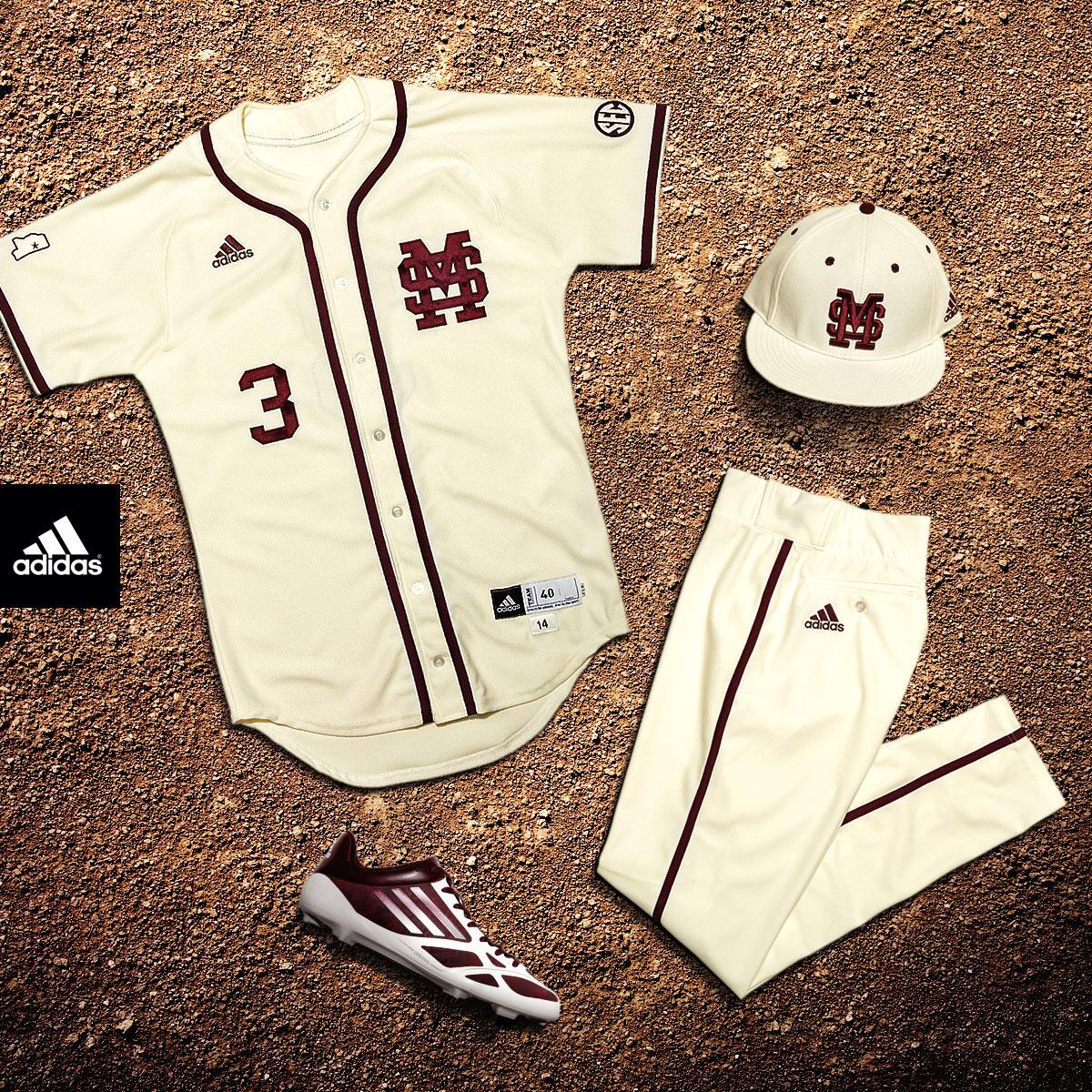
anybody got pics of the baseball unis? i heard they look awesome.
if you say yes, i dont believe you OR you are probably walking around with your t-shirt tucked in to your jorts.
its an improvement, but these could have been awesome had they not made a few poor design choices. im just as sick of bitching as you are with hearing the bitching. dammit, i just want to get classic uniforms without all the silly ******** that 17es it up. take away the m state outline on the hip and i really like them, take away the crappy bulldog lettering and i love them, take away the hail state and substitute miss state (hail state > mississippi state banner, so thank goodness the adidas design monkeys didnt go that route), and they are arguably the best uniform we have ever had. the little things really make a difference.
i love the bones of the uniform (particularly the stripes and general layout), but how great is the mona lisa if you paint a mustache on her? kinda ruins it doesnt it? could have been a 9/10, maybe better, but i give them a 7/10. for reference, i would give last years a 5/10, so if you are looking for something positive, its getting better, but we aint there yet.
and no, i dont want to look like alabama. i want something unique to us, but unique doesnt require adding details that bring down the look.
anybody got pics of the baseball unis? i heard they look awesome.
They 17ed up the whole uniform with the stupid *** mstate on the side of the pants. What the hell? Do they just sit there and throw **** to see if it will stick? Turrible. The sad thing is is those unis are bad *** and the best thing they've done so far but they always find a way to screw it up.
Sixpack Thought Process
OH NO.... We will lose... It has black on it...
OH NO.... We will lose... It has black on it...
check the top of this thread. those are official release pics.
The MState on the pants looks something from victoria secret that says pink on the ***.
Whoever made this decision is probably going to get fired at adidas. Poor schmuck. With all that being said, you replace that logo with a small State of Mississippi profile on the hip and this uniform is gold.
Yes they could also do better on the text too. At least Bulldogs wasn't misspelled like Remond was last year.
found a pic of the baseball unis.
regarding the football uniforms, now that i think back to how bad they were even last season, i think adidas did a good enough job.
im relieved not to see the banner Mississippi state across the chest, so thats an improvement. the stripes are a huge improvement and with a little more tweaking, these could be winners. i think adidas deserves a pat on the back for getting it closer and you have to applaud them for their loyalty. perhaps i have been too rough on them. i guess i should be more appreciative of what is NOT on the jersey. thats about all the fashion talk i can handle today.