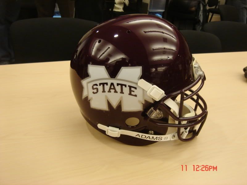
Helmet logo question

DovaDawg

Redshirt
Aug 28, 2007
595
0
11
I thought the idea of the logo redesign was to help make Mississippi State a more recognizable entity. How is using a "washed out" M State going to help that? To the person that is non-familiar with MSU, they will not know what that logo is. This seems to be almost as bad an idea as the Ole Miss blob as it will only be a recognizable symbol to the fan base and those in the region.


</p>
 

dawgatUSM

Redshirt
Apr 6, 2008
3,835
27
48
I personally don't think it looks all that bad. but that's just me. it's much more modern...
 

was21

Senior
May 29, 2007
9,981
616
113
of the state of Mississippi and a Bulldog head and the word State. They might consider it, but probably won't because they know that I like it.
 
Maroon and White

Latest

  1. 01 Maroon and White Jeff Lebby talks Mississippi State Saturday Scrimmage: "A ton of good on good"
  2. 02 On3 UNLV transfer forward Kimani Hamilton signs with Mississippi State
  3. 03 Maroon and White Mississippi State's WR room is a strength, the question is "how strong?"
  4. 04 Maroon and White OL Mario Nash Jr. no longer on Mississippi State roster
  5. 05 Maroon and White Mississippi State WBK adds international transfer Grace Ndubueze