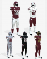
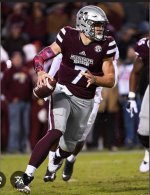
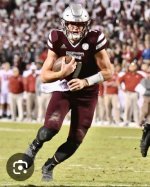
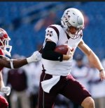
More jersey talk!!!!!
- Thread starter dawgstudent
- Start date
You are using an out of date browser. It may not display this or other websites correctly.
You should upgrade or use an alternative browser.
You should upgrade or use an alternative browser.
Lifetime contract for the new AD if he brings these with him.
If would be perfectly happy if we exclusively wore grey pants the way UGA wears silver pants.
The 2015-2017 “grey trousers with maroon piping and M-state at the top” was the best.
Just put STATE where MISS. STATE is, and I’m listening
Why do most love the Miss. State on the chest? It looks so cheap, like a practice jersey. It's terrible. The interlocking logo is great on the helmet but find something better for the chest. I just don't understand it.No to all
I dislike the third colors highlighting the letters and numbers and the letters in the maroon & gold uniforms should be solid gold…
Miss. State is unreadable…
No to all except top left.
Maroon helmets, always and only.
I bet Selmon reads all these uniform posts with his notebook out writing down everybody's great idea so he can quickly implement them.
Yeah. Either State or Mississippi State. Just say no to our being like our rivals with Miss or script helmets.Just put STATE where MISS. STATE is, and I’m listening
I’m not a big fan of it but compared to the banneresque Mississippi State it’s much superior…Why do most love the Miss. State on the chest? It looks so cheap, like a practice jersey. It's terrible. The interlocking logo is great on the helmet but find something better for the chest. I just don't understand it.
My first option would be to go with the SEC logo and the university seal positioned on the left & right sides of the chest…
It's real simple....no maroon pants, no white lids......the best uniform we ever wore in a single game was the bowl game against NCSt when Dak was QB
I’m not a big fan of it but compared to the banneresque Mississippi State it’s much superior…
My first option would be to go with the SEC logo and the university seal positioned on the left & right sides of the chest…
Adidas would never let that happen, got to have their name and 3 stripes on there
Can't forget about the Russell Athletic days either. Good times.Adidas would never let that happen, got to have their name and 3 stripes on there
Allow me to state the simple rules of decency once aGAIN:
1. NO MAROON PANTS
2. NO WHITE HELMETS (except when wearing all white)
1. NO MAROON PANTS
2. NO WHITE HELMETS (except when wearing all white)
22 replies and 22 different opinions!!
I don't like any of the helmets besides the maroon ones. I don't think State should ever wear a helmet color other than maroon.
No white lids - I agree with; count me in. However, I've always been a big fan (and in the minority) of maroon pants. I also like the silver/grey third color for outline purposes, and of course the gray pants. Question: Why hasn't anyone ever proposed a silver/gray helmet with maroon trim? I would certainly like that a hundred times more than those horrendous white helmets.It's real simple....no maroon pants, no white lids......the best uniform we ever wore in a single game was the bowl game against NCSt when Dak was QB
We wore them some one year. When we played at Gillette Stadium we wore them and designed our uniforms reminiscent to the PatriotsQuestion: Why hasn't anyone ever proposed a silver/gray helmet with maroon trim? I would certainly like that a hundred times more than those horrendous white helmets.
Attachments
The black stripes are bad and have always looked bad. You can do cool jerseys with the Interlocking without copying the 96-03 jerseys.
This seems a bit like loser mentality.Not sure why it matters what we look like when we lose.
You've never dressed up for a job interview? How about a first date? You dress up occasionally to make yourself look better because you perform better when you're confident. Hence the phrases "dress for success", or even "fake it til you make it"... Job counselors promote dressing like the person you want to be in the future, not like the underling you might be currently.
Therefore, we need to at least pretend we are a real SEC team. That's why deleting the maroon pants is so important.
You can get that on the jersey with large font and not look cramped. Basically, it gets the point across with a quick glance. The logos we have used in the past can't be seen well on TV.Why do most love the Miss. State on the chest? It looks so cheap, like a practice jersey. It's terrible. The interlocking logo is great on the helmet but find something better for the chest. I just don't understand it.
The only nit I have personally is someone might say "Missouri State?" I don't think there are many people out there that would think they are watching a Missouri state game though.


