MSU logo battles.
- Thread starter DesotoCountyDawg
- Start date
You are using an out of date browser. It may not display this or other websites correctly.
You should upgrade or use an alternative browser.
You should upgrade or use an alternative browser.
Why are you ignoring 1996-2000 when discussing the interlocking MSU?
If it had only been used from 2001-2003 it would be the least popular logo of all time. But folks associate it with 98 and 99, two of our best years ever.
If it had only been used from 2001-2003 it would be the least popular logo of all time. But folks associate it with 98 and 99, two of our best years ever.


Because people try to associate MState with Croom only.Why are you ignoring 1996-2000 when discussing the interlocking MSU?
If it had only been used from 2001-2003 it would be the least popular logo of all time. But folks associate it with 98 and 99, two of our best years ever.
When the fact is MState 1.0 represents the most successful era of Mississippi State men's basketball too. ...and was used as the midfield logo and tv graphic for State football from 97-08 too.
MState 2,0 represents the most successful era of Mississippi State football and women's basketball.
Posting this so I can watch the battle begin.
1,2,3
Banner M foreva
If I can only keep 3 then it is:
2 for baseball (although I'm upset I don't see the 85's)
6 for football
3 for everything else. It looks good on basketball and softball uni's
2 for baseball (although I'm upset I don't see the 85's)
6 for football
3 for everything else. It looks good on basketball and softball uni's
Walking Bully in color reminds me of growing up and the only place to get MSU stuff locally was at Walmart. If I see it now it’s like I took a Walmart shirt and made it even worse. I like it on cowbells though.
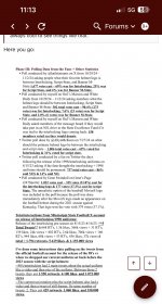
I see a lot of you picking #9. Did you know that the university had totally discontinued it?

4 5 and 7 are discontinued too on official MSU gear.I see a lot of you picking #9. Did you know that the university had totally discontinued it?
View attachment 805141
That’s not the point. It’s just asking what logos you like.


The point is....our branding is stupid. And the fact that literally no one here can agree, bears that out.4 5 and 7 are discontinued too on official MSU gear.
That’s not the point. It’s just asking what logos you like.
We can't even agree that our official school logo for 25 years, needs to be preserved.
You act like State is the only school with multiple logos. Look at LSU and Florida and they have rebranded themselves over the years just like State has done. I bet if you did the same thing with Florida logos on their message board it would be the same kind of discussion.The point is....our branding is stupid. And the fact that literally no one here can agree, bears that out.
We can't even agree that our official school logo for 25 years, needs to be preserved.
Stop. Nobody changes on the whims of emotions and incoming administrations/coaching regimes like we do. It's not even debatable. LSU and Florida? Legit LOL.You act like State is the only school with multiple logos. Look at LSU and Florida and they have rebranded themselves over the years just like State has done. I bet if you did the same thing with Florida logos on their message board it would be the same kind of discussion.
I know you like to minimize everything negative but we've got real problems with school branding, most of which we created ourselves.
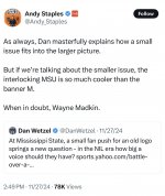
This is the most ridiculous reason to not use a logo I’ve ever heard. The 96-03 MSU is by far the best looking helmet logo we have ever had. No one gives a sh*t that the end of the Jackie era was bad in the uniforms. They look good and like an SEC football program. The logo in your profile looks like a MS JUCO logo. You are in the severe minority within this fanbase of your opinion and there is data to back that up. A dude literally sat down with our AD and gave him that information and got a story written by Andy Staples on it. The 90s throwback uniforms got over 1 million views when they released the twitter video 2 years ago.A better representative for a MSU logo is the 1986 to 1995 MSU logo. It ran for 10 seasons and was the longest running MSU logo, that MSU has ever used.
Regarding 6, skinny MSU, represents the worst 3 years of MSU football since the 1960s. The last time MSU wore that logo, Arkansas beat State 52-6.. Skinny MSUs last 6 SEC games.....was outscored 267-57. Well, if you count the 03 egg bowl, in which Jackie wore Bama helmets instead. But the ugly thing was on the sleeves. .......and was capped off by NCAA probation.
It was on the football field for one year in 1996 and replaced at midfield by MState in 1997.
Attachments
-
 IMG_7874.jpeg636.1 KB · Views: 8
 -
 IMG_7875.jpeg306.7 KB · Views: 7
Last edited:
2, 6 and 10. 10 is obviously what I use in my avatar. The wrong handed swinging bully.

In the 1980s I remember that the same artist created a bully for each sport but the others never seemed to get legs.
In the 1980s I remember that the same artist created a bully for each sport but the others never seemed to get legs.
2, 6, & 9
I also like one that's not on the list, the aerospace one with the swooping upward arrow.
I also like one that's not on the list, the aerospace one with the swooping upward arrow.
We know…..we know. You flip the 17 out every time someone brings up logos.Stop. Nobody changes on the whims of emotions and incoming administrations/coaching regimes like we do. It's not even debatable. LSU and Florida? Legit LOL.
I know you like to minimize everything negative but we've got real problems with school branding, most of which we created ourselves.
No one is flipping out. You were, however, wrong in your comparison. And I certainly won't convince you, so carry on.We know…..we know. You flip the 17 out every time someone brings up logos.
Posting this so I can watch the battle begin.
Overall athletic department logo:

Baseball (although, I don't see why softball can't use it):

Football helmets only

I associate Walking Bully with the cheap apparel you'd see in the 80's and 90's. It's objectively bad.I simultaneously miss Walking Bully, and never want to see it used again.
A friend of mine bought me an MSU t-shirt from a thrift shop that had a collage of campus buildings flanked by two Walking Bullys. It was an awesome Christmas present, but I will never wear it.
There's a reason why we never put it on a uniform/helmet/cap
2 6 9 is only safe if you shower after the 2. Otherwise somebody might get pink eye.2 6 9
96 msu is the worst looking logo ever used. looks like some kindergarten came up with that. Also, I'm pretty sure the voters in that article are the same people here.This is the most ridiculous reason to not use a logo I’ve ever heard. The 96-03 MSU is by far the best looking helmet logo we have ever had. No one gives a sh*t that the end of the Jackie era was bad in the uniforms. They look good and like an SEC football program. The logo in your profile looks like a MS JUCO logo. You are in the severe minority within this fanbase of your opinion and there is data to give me that data. A dude literally sat down with our AD and gave him that information and got a story written by Andy Staples on it. The 90s throwback uniforms got over 1 million views when they released the twitter video 2 years ago.
People in an official capacity at Mississippi State liked the MState logo better. Which is why they sh*t canned skinny msui in 2004 and again in 2009. Also I talk to State fans and go to games. MState is liked and still worn with all the options today.
MState is THE logo of Mississippi State University and has been officially for 16 years and unofficially for another 8 years.
skinny MSU was never more than a short run football logo used only on football uniforms and never anywhere else within the university.