MSU Makes Top Worst Helmet Desgin List
- Thread starter Indndawg
- Start date
You are using an out of date browser. It may not display this or other websites correctly.
You should upgrade or use an alternative browser.
You should upgrade or use an alternative browser.
The guy who wrote that is just some douche with an opinion. No better than anybody here or elsewhere.<div>Must be slow for him if he has time to talk about which helmets are pretty.</div>
The N stands for Nowledge.jakldawg said:What the hell does that even mean?
AA - $1
TCU: If LSU does this template right, TCU does it wrong. The logo and script are too big, too smashed into one another.
LSU has one of the worst helmets ever. It looks like a high school helmet.
LSU has one of the worst helmets ever. It looks like a high school helmet.
I am Crooming today.
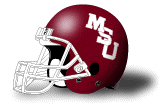
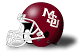
First defending soccer, now this...........but I am sorry but the new helmets are not an improvement over Croom's helmets. Sure they are maroon but the new MState logo was a step backwards and maroon facemasks don't help. I thought aTm screwed up their helmet a few years ago going to maroon facemasks. Looks much better now they have switched back. I am not saying we have one of the 10 worst but it certainly isn't the best. I would like to see State go back to the original MState logo in white and have white facemasks. That would help tremendously.
I agree on what he said about Memphis. They screwed up switching from silver to blue helmets and going with the black fad on the facemask. Arizona's switch from their white helmets was a screw up as well. Agreed on the NCSt logo. Agreed on Texas Tech and their logo and all black with the flakes or glitter or whatever the hell you call it.
They stole it from Hattiesburg High.Sutterkane woya said:
LSU has one of the worst helmets ever. It looks like a high school helmet.

I like our new logo. I like maroon helmets. I like maroon facemasks.Agentdog said:I am Crooming today.
First defending soccer, now this...........but I am sorry but the new helmets are not an improvement over Croom's helmets. Sure they are maroon but the new MState logo was a step backwards and maroon facemasks don't help. I thought aTm screwed up their helmet a few years ago going to maroon facemasks. Looks much better now they have switched back. I am not saying we have one of the 10 worst but it certainly isn't the best. I would like to see State go back to the original MState logo in white and have white facemasks. That would help tremendously.
I agree on what he said about Memphis. They screwed up switching from silver to blue helmets and going with the black fad on the facemask. Arizona's switch from their white helmets was a screw up as well. Agreed on the NCSt logo. Agreed on Texas Tech and their logo and all black with the flakes or glitter or whatever the hell you call it.
I don't like that our all-white logo on our maroon helmet looks like a splash from anything other than close up. Maybe it needs to be bigger. It needs something to make it more clear.
Glad to finally see someone else that hates the LSU helmet. The font is plain and uninspired. The tiger head is generic. It is just plain ugly. Literally both plain and ugly. The only reason the helmet is popular is because they've had it forever and fans know nothing else.Sutterkane woya said:TCU: If LSU does this template right, TCU does it wrong. The logo and script are too big, too smashed into one another.
LSU has one of the worst helmets ever. It looks like a high school helmet.
...and treatment of opposing fans.
If the article was "most passion" or "best party", yeah, you'd have a point. But you can't say "best fans" and exclude the many documented cases of dickheadedness exhibited by that fan base.
Oh, and nobody should from LA should give Alabama **** for sidewalk fans. Every toothless uneducated hick @+%+ from Tallulah to Bossier City has an LSU hat and loves the Tiggahhhhssss.
J
JimHalpert.nafoom
Guest
I don't think the university wants MSU to be anywhere on our uniforms. That's why they updated the M-State to be unique and identifiable with our school. Now whether that is the best option for State, I don't know.
I dislike like this logo much more than our current one:

Stroooong:


I dislike like this logo much more than our current one:
Stroooong:
And I understand that the school has made the decision that the M-State logo is THE only logo we'll have (except for baseball), but I think it looks like **** on a football helmet. I think we could pretty easily come up with a new interlocking logo somewhere between the Bellard one and the Sherrill one that could get past the trademark issue and look pretty good.
 </p>
</p>
Put the bulldog head either with or with out the curved Mississippi State on both sides of the helmet, with the dog facing forward.

Then take our 1998 Nike jerseys and pants replace MISS STATE with:

and then just have the two maroon striped going around the arms.
On the pants, you could replace the interlocking MSU on the left hip with any of the above logos or use the new M-State that we have developed.
Then take our 1998 Nike jerseys and pants replace MISS STATE with:
and then just have the two maroon striped going around the arms.
On the pants, you could replace the interlocking MSU on the left hip with any of the above logos or use the new M-State that we have developed.
A little too cartoon-y. I agree with most that the helmet is much better but still not great. I still really like the uniforms though.
That got me thinking, we covered every combo last year:
All Maroon:

All White:

White Top, Maroon Bottom:

Maroon Top, White Bottom:

And of course Black

That got me thinking, we covered every combo last year:
All Maroon:
All White:
White Top, Maroon Bottom:
Maroon Top, White Bottom:
And of course Black
And I agree that our helmets are MUCH better than the Croom helmets, though cleaning up the logo might be an improvement.
As for the current uniforms, I just wish they said "MISS. STATE" across the chest like the Sherrill uni's did. I know, we're trying to get away from that, but i thought it was pretty unique. I also think having the small logo in the middle there makes it look more swac-ish.</p>
As for the current uniforms, I just wish they said "MISS. STATE" across the chest like the Sherrill uni's did. I know, we're trying to get away from that, but i thought it was pretty unique. I also think having the small logo in the middle there makes it look more swac-ish.</p>