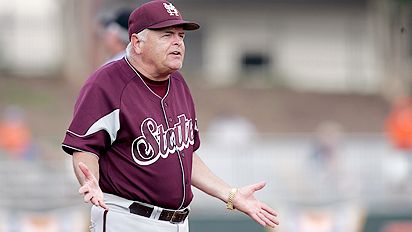
One of the 2009 baseball uniforms...
- Thread starter dawgstudent
- Start date
You are using an out of date browser. It may not display this or other websites correctly.
You should upgrade or use an alternative browser.
You should upgrade or use an alternative browser.

A) I thought the Russell contract was over.
B) Wow, they really went old school. Maybe a little too much frill on the letters. I still like it better than last year.
C) I wonder what the numbers on the back are going to look like. If it is an enlarged version of the 27 on the front, that might look scary. Oregon State's are similar and they look good, so there is hope.
D) I would prefer just a traditional script.
E) It appears this is a Russell trademark, but I always like to see at least the hint of a border around the letters. Even if it is just a pinstripe of a black or gray line. Otherwise, it just looks like something I could have ironed on. See Oregon St. uni below.
F) Overall, I like it - kind of like a Rice of Arizona St. vibe. Nothing wrong with that. I give it a B+
Hmm.
I like the concept, but the jury is still out. Have to see it in action at DNF before I can decide. Big improvement tho.
And, dammit, can we please ditch russell already?
I like the concept, but the jury is still out. Have to see it in action at DNF before I can decide. Big improvement tho.
And, dammit, can we please ditch russell already?
Love it!
My favorites are the old grey ones with the script Mississippi State across the front in maroon. We wore them for a practice day and team photo during the CWS 2007 but for the life of me I can find the photo on the internet.
My favorites are the old grey ones with the script Mississippi State across the front in maroon. We wore them for a practice day and team photo during the CWS 2007 but for the life of me I can find the photo on the internet.
AzzurriDawg4 said:A) I thought the Russell contract was over.
I believe the Russell contract runs through the end of this school year. Adidas stuff will kick in with football next season. If that's right, then I assume this particular uniform will be one and done.
i love the uniforms. they'll look even better on the field. i just hope it's a msu thing, not a russell thing, and that we don't wear those fugly white hats.
i love the "i hope no one notices i took this picture" feel also. looks like it was cut out in MSPaint. i wonder who sent it to DS...</p>
i love the "i hope no one notices i took this picture" feel also. looks like it was cut out in MSPaint. i wonder who sent it to DS...</p>
H
hdghdawg
Guest
old school with the MS over the heart. Kind of hoped we'd go back to the traditional whole white ones, but close enough.
i figured it was something along those lines. only on the sixpack - gotta love it. it has a real "deep throat" feel to it. that's what she said.We have to protect the innocent.
These look familiar.Irondawg said:initially I don't really like the font, but maybe it looks better when worn

I think the M should be the biggest letter, not the S.
Never been a big fan of the maroon top over grey pants. I've always thought the tops and "trousers" should be the same. In high school, we had black tops that we wore to away games. I hated them because in late April, in AL you just bake in them. I gotta believe the maroon is similar. I would rather see the MS on one side w/ the number on the other. I don't think there is any precedence for the olde timey lettering.
Never been a big fan of the maroon top over grey pants. I've always thought the tops and "trousers" should be the same. In high school, we had black tops that we wore to away games. I hated them because in late April, in AL you just bake in them. I gotta believe the maroon is similar. I would rather see the MS on one side w/ the number on the other. I don't think there is any precedence for the olde timey lettering.
You mean like my avatar, but sleeveless? I like it if so.hdghdawg said:old school with the MS over the heart. Kind of hoped we'd go back to the traditional whole white ones, but close enough.
H
hdghdawg
Guest
starts posting game aticles featuring action pictures of Powers and Freeman from last year. You know it's going to happen.