Pick Your Favorite from the 3rd Page
- Thread starter dawgstudent
- Start date
You are using an out of date browser. It may not display this or other websites correctly.
You should upgrade or use an alternative browser.
You should upgrade or use an alternative browser.

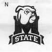
G and Q if they had the interlocking M & S.
I may have missed it but is there some reason the interlocking M & S can't be used except for baseball?
I may have missed it but is there some reason the interlocking M & S can't be used except for baseball?
of working in an AD while the mascot and logos were contemporized, the way it works is we'll pick about four or five of these and they'll be our catalogue of licensed mascots/logos. So we'll probably end up with about one for each of those groupings. Forgive me if this is common knowledge.
S
SteelDawg99
Guest

that was used for many years, would be better than any of those....and true to State form, it was done away with....maybe had something to do with the fact that it came into use during the Bob Tyler years. I don't think he came up with it, but that's when it came into use.

D
Dawg725
Guest
but I like these:

I really like this one:
But I would add the STATE banner to the front of the "M".
I really like this one:
But I would add the STATE banner to the front of the "M".
but the bully needs tweaking so he doesn't look like f'n droopy dog. ****. You gotta believe these were all trial balloons. Detailed refinement to come later. I want the bully to look like he would qualify for banishment from the City of Richland Aggressive Dog Ordinance.
S
SteelDawg99
Guest
do ANYTHING to help clear up the confusion between Mississippi State and other schools/teams ! As for that goal, this is another design effort gone awry because the "professional" designers lost sight of the reason the logos were being redesigned.
The drawings of the Bulldogs are simple (lacking detail), but maybe that's what the goal was...easier to draw, reproduce, etc.
These aren't as bad as "Rowdy Rebel" but I'm, not bowled over.
I truly believe that MSU could sponsor a contest that's open to the public and end up with better designs. Just offer a $10,000 prize or 4 season tickets (in every sport) for the winning entry.
B, D, and Q are great for large logos
J is my vote for a helmet logo, the only other one that should be allowed to go on a helmet is E
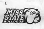
I usually hate Miss. State abbreviated that way, but i really like logo L
M would be good at half-court at the hump
F would make a pretty cool shield
J is my vote for a helmet logo, the only other one that should be allowed to go on a helmet is E
I usually hate Miss. State abbreviated that way, but i really like logo L
M would be good at half-court at the hump
F would make a pretty cool shield
I think they're all pretty bad and cheep looking. But, if I had to choose, I would take D and L. Those need work though.
I'd take "J" and leave it big, but tilt it and make it a little more sleek and jagged, much like (but not quite like) the Jacksonville Jaguars helmet, and maybe throw a slightly arched State on top of it, or just leave the Dog-head by itself and put State on the front lip of the helmet in small print like we've done before. I wouldn't mind leaving a little detail out as long as it was clearly a Bulldog that looked mean as hell, just to give it some old school flavor like LSU's Tiger logo... but not so it would look like theirs.
I think helmets look best and more classic when they are somewhat plain, but easily recognizable. I mean, we have a friggin' banner on ours now. It's just too much detail. I don't want a giant "M" on our helmets unless there's an "S" and/or a "U" there as well. Gimme the dog-head, the interlocking MSU or the baseball MS. Any of those helmets would be a sharp improvement.
I think helmets look best and more classic when they are somewhat plain, but easily recognizable. I mean, we have a friggin' banner on ours now. It's just too much detail. I don't want a giant "M" on our helmets unless there's an "S" and/or a "U" there as well. Gimme the dog-head, the interlocking MSU or the baseball MS. Any of those helmets would be a sharp improvement.
W
woofdwoof
Guest
otherwise all are terrible.
too played, too out-dated, no design what so ever.
Back to drawing board please!
too played, too out-dated, no design what so ever.
Back to drawing board please!