Random Uniform related question
- Thread starter J-Dawg
- Start date
You are using an out of date browser. It may not display this or other websites correctly.
You should upgrade or use an alternative browser.
You should upgrade or use an alternative browser.


Meh, it doesn't really knock my socks off. I'm cool with our current Football uniforms, best ones we've had since the late 1990s.
View attachment 3773
View attachment 3773

The M over S is a thin logo, and that on a football helmet would look strange. It looks great on a hat, but not on a football helmet.

This^^. Baseball has a longer legacy than most other sports. The logos/emblems that work are classic & should not be alterred.
I realize it's a opinion and I am also aware that Banner M is here to stay. I just don't love it and never will. I will live though, it's not that big a deal.
Why is it that we have never incorporated the baseball M-over-S emblem into our football or basketball uniforms. It's by far our best emblem. Classic and recognizable.
I guess I've just never understood why we have multiple emblems in the first place.
Been there done that. The interlocking MS was on the football helmets inthe1970's.
I agree. I like the NEW, less clumbsy, less intricate, understated Banner-M. I'm no artist or graphics guy, so someone else can find the term I'm looking for. It's simple & to the point & unique...now.
Been there done that. The interlocking MS was on the football helmets inthe1970's.
http://nationalchamps.net/Helmet_Project/
It had an M and S but not interlocking. You can go to the link, then Southeastern and see them all...there was a bulldog logo that the website owner needs better pictures of.
View attachment 3791
It's balanced & both athletic/academic. It's perfect. It looks good on both sides of helmet (look at nike's interlocking MSU and tell me the left side doesn't look better than right side of helmet). It fits perfectly inside any space (if you've ever tried to line up bama's "A", u'll know what I'm I'm talking about--always looks off balance). Also, I like our word-marked Mississippi State {banner} logo too. It sure makes M I S S I S S I P P I S T A T E way more compact and easier on the eyes. As a designer/graphic dude, I like our rebranding decisions, minus the bulldog head--I think it could've been done way better (but I'm a bulldog drawing fool and not easily impressed by others' bulldog illustrations). In closing, I hope we never see the day our baseball MS logo is not on our cap. It should remain until Jesus comes back. Even tho it was taken from the very old Notre Dame ND logo (in my opinion).I agree. I like the NEW, less clumbsy, less intricate, understated Banner-M. I'm no artist or graphics guy, so someone else can find the term I'm looking for. It's simple & to the point & unique...now.
All those teams non baseball logos are good to decent. Banner M sucks,
I am not a fan of Banner M either. The banner is superfluous. Not academic, just juvenile. And if it were academic, why the hell would we want it on the football bonnets? They should design a "Banner-Book" M so that we can show Vandy that State are the real bibliophiles in the SEC.
Banner M has had its run for over a decade. It's past time to start looking for a replacement.
Latest
-
01
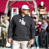 Maroon and White
Points of Focus from Jeff Lebby in Week 12 media availability
-
02
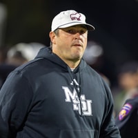 Maroon and White Football
What Mississippi State HC Jeff Lebby said about Sunday staff changes
-
03
 On3 Football
Over 35% of Power Four starting quarterbacks missed games with injuries in 2026
-
04
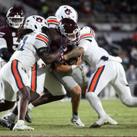 Maroon and White Football
Sunday Notebook: Auburn 41-9 Mississippi State
-
05
 Rivals Football Recruiting
Biggest rankings risers in the updated 2027 Rivals300 rankings