On mobile so I couldn't embed
https://twitter.com/HailStateFB/status/453608299917611008
New unis...again.
https://twitter.com/HailStateFB/status/453608299917611008
New unis...again.
Last edited:
Is that a black stripe I see? A little reverse on the late Sherrill-era adornments would be sweet.
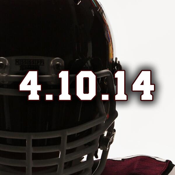
thats what im looking forward toojust wait til the crotch shot on 4/10/14.


this will have to tide you over:

Adidas's best State uniforms


These?