"Let's Go Shot for Shot": Stacking Up Pitino and Calipari's Maker's Mark Bottles
After winning the national championship this year with Louisville, Maker's Mark has honored Rick Pitino with a custom bottle commemorating this season's success. Sure, Kentucky fans could be bitter about it, but a) Calipari already received a commemorative bottle in 2010 and b) he will surely receive one next year after winning the 2014 national title.
A photo of the bottle, which will be on sale this Friday and whose sales' benefit the Academic Center of Excellence on Louisville's campus (Gordon Gee is pleased with this decision), was released this week, and I thought it would be fun to see how it compares to Calipari's of 2010.
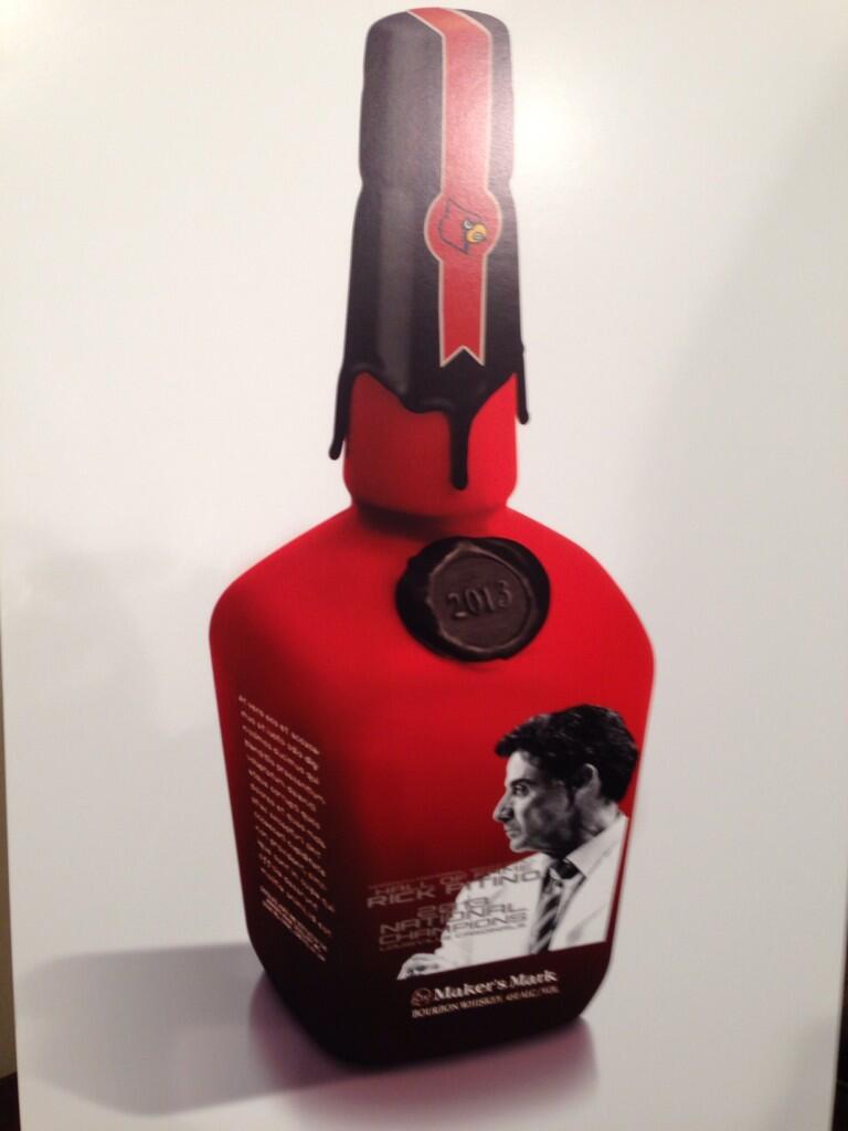
 Let's start from the top: Pitino's bottle features a sharply contrasting black and red seal with the Angry Bird logo snarling at whoever may dare to break the seal. Calipari's, on the other hand, keeps the seal a solid Kentucky blue with a white ribbon baring the UK logo and, if you look closely, "Wildcats" imprinted above the logo. The simplicity and elegance of Cal's seal wins here. Shot: Calipari Maker's.
Wax seal with date: Pitino's soon-to-be-released bottle notes the year with a layered seal: black and a coopery brown over it. To me, it kind of looks old-fashioned, which would nicely blend with Louisville's preferred use of Ye Olde English font on all their apparel. Cal's is all blue, everything- pretty, but hard on the eyes. Shot: Pitino Maker's.
Portrait of the coach: Man, did Maker's capture Pitino mid-glare or what? I can clearly see the hollows of his cheeks, the vein near-to-bursting in his neck, the glint of silver beginning to creep into his hair. Realistic? Yes. Kind of scary? Also yes. Calipari's silhouette is more minimalist, showing the coach with a generically stern expression. We love Calipari for his outrageous expressions and meme-ability (is that a word? It is now); Maker's could have done much more to capture his personality. Shot: Tie. Double fist.
Overall design of bottle front: Pitino's is BUSY. There is a lot happening on that bottle, and when I'm drinking bourbon, reading those words is the last thing I want to be doing (for the record, I would much rather be securing shots for my best friend Aaron Flener and me, or perhaps collaborating with Nick Roush on a karaoke duet. Maybe snap-chatting. But definitely not reading). Also, can we talk about the hideous red-to-black ombre fade? Pitino's bottle is just trying way too hard. Calipari's, meanwhile, is more in line with the classically tailored suits our man loves to wear on the sidelines. All blue, with "Calipari" in a wide-spaced, easy to read font. If you're buying this bottle for purely aesthetic purposes, Calipari's would be a much better complement to anything else on your liquor shelf, while Pitino's aggressively garish bottle would look more at home at a dive bar under some bad lighting. Shot: Calipari's Maker's.
Contents: Both contain Maker's Mark Bourbon Whisky, at 45% alcohol content. Everyone wins. Chug.
@KristenGeilKSR
Let's start from the top: Pitino's bottle features a sharply contrasting black and red seal with the Angry Bird logo snarling at whoever may dare to break the seal. Calipari's, on the other hand, keeps the seal a solid Kentucky blue with a white ribbon baring the UK logo and, if you look closely, "Wildcats" imprinted above the logo. The simplicity and elegance of Cal's seal wins here. Shot: Calipari Maker's.
Wax seal with date: Pitino's soon-to-be-released bottle notes the year with a layered seal: black and a coopery brown over it. To me, it kind of looks old-fashioned, which would nicely blend with Louisville's preferred use of Ye Olde English font on all their apparel. Cal's is all blue, everything- pretty, but hard on the eyes. Shot: Pitino Maker's.
Portrait of the coach: Man, did Maker's capture Pitino mid-glare or what? I can clearly see the hollows of his cheeks, the vein near-to-bursting in his neck, the glint of silver beginning to creep into his hair. Realistic? Yes. Kind of scary? Also yes. Calipari's silhouette is more minimalist, showing the coach with a generically stern expression. We love Calipari for his outrageous expressions and meme-ability (is that a word? It is now); Maker's could have done much more to capture his personality. Shot: Tie. Double fist.
Overall design of bottle front: Pitino's is BUSY. There is a lot happening on that bottle, and when I'm drinking bourbon, reading those words is the last thing I want to be doing (for the record, I would much rather be securing shots for my best friend Aaron Flener and me, or perhaps collaborating with Nick Roush on a karaoke duet. Maybe snap-chatting. But definitely not reading). Also, can we talk about the hideous red-to-black ombre fade? Pitino's bottle is just trying way too hard. Calipari's, meanwhile, is more in line with the classically tailored suits our man loves to wear on the sidelines. All blue, with "Calipari" in a wide-spaced, easy to read font. If you're buying this bottle for purely aesthetic purposes, Calipari's would be a much better complement to anything else on your liquor shelf, while Pitino's aggressively garish bottle would look more at home at a dive bar under some bad lighting. Shot: Calipari's Maker's.
Contents: Both contain Maker's Mark Bourbon Whisky, at 45% alcohol content. Everyone wins. Chug.
@KristenGeilKSR
Discuss This Article
Comments have moved.
Join the conversation and talk about this article and all things Kentucky Sports in the new KSR Message Board.
KSBoard