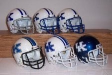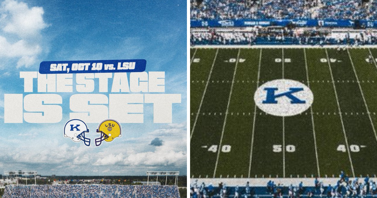
The Power K is back! Kentucky teases throwback look for LSU game
Kentucky all but confirmed that the Power K logo will return for the LSU game, using it twice in a social media graphic on Monday.


I'm indifferent on the Power K. It will be good to see for certain games, I guess. But I absolutely hate the chrome helmets. Hate.Where’s your chrome?


Kind of glad to hear I’m not the only one.I've never understood the appeal of the Power K...and I'm an old-timer.
One, it doesn't look all that "powerful." The font is skinny. And two, we went 108-144-5 during that 22-year stretch (thanks, AI).
However, if that's what Stein wants, then I'll make myself get excited.
We’re 163-191 since we started using the interlocking logo in ‘97. Don’t think it’s just the power K, we’ve been pretty bad historically. Our best years were with leather helmets and no face masks when we went 2-0 a couple of years.I've never understood the appeal of the Power K...and I'm an old-timer.
One, it doesn't look all that "powerful." The font is skinny. And two, we went 108-144-5 during that 22-year stretch (thanks, AI).
However, if that's what Stein wants, then I'll make myself get excited.
There’s still some on here:Power K hats already sold out so it does matter to quite a few.
Because it looks like a classic logo. It should be our permanent logo. The new "UK" is a joke. Just like Alabama's A, Texas and Tennessee's T's, and UNC's NC, Duke's D, etc etc.Kind of glad to hear I’m not the only one.
Definitely not something worth getting angry about, but I’ve never quite understood why this particular logo seems to have near mythical status with a lot of our fans. It’s maybe slightly more distinct than the current “UK” logo, but is still just the letter K at the end of the day. I would personally be more excited if they revived one of the old wildcat logos.
Where’s your chrome?
Where’s your chrome?
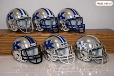
It’s too bad those seem to be considered tainted in a lot of minds because our program was in the gutter at the time and we lost that game in embarrassing fashion. Those uniforms were pretty close to perfection on their own merits.Those 2005 throwbacks for Ohio U. were pretty sweet.
 KSR Football
Will Stein Show Recap: Kentucky's offense can get better
KSR Football
Will Stein Show Recap: Kentucky's offense can get better
 KSR Cats in the NBA
Otega Oweh will miss entire season with Achilles injury
KSR Cats in the NBA
Otega Oweh will miss entire season with Achilles injury
 KSR Basketball
Milan Momcilovic is ready to show the world he's more than just a shooter
KSR Basketball
Milan Momcilovic is ready to show the world he's more than just a shooter
 KSR Football
SEC Availability Report: CJ Baxter is questionable, Nic Anderson is probable
KSR Football
SEC Availability Report: CJ Baxter is questionable, Nic Anderson is probable
 KSR Basketball
Zoom Diallo was 'pound-the-rock guy,' but ability to connect could have Kentucky playing in April
KSR Basketball
Zoom Diallo was 'pound-the-rock guy,' but ability to connect could have Kentucky playing in April