Adidas reads the pack
- Thread starter esplanade91
- Start date
You are using an out of date browser. It may not display this or other websites correctly.
You should upgrade or use an alternative browser.
You should upgrade or use an alternative browser.
no stripe = awesome. glad to know adidas finally got around to us...i suppose they felt like they were throwing us a bone...one that im happy we got. im not getting my hopes up though. just release the damn things already so we can quell the complaining or crank it up. at least adidas is showing a little effort in this contract year....the only thing that scares me, once we finally hit a good jersey/helmet combo, adidas might give us another one the very next year and the process begins again.
upon further investigation, we get a peak at ours the day olive branch has pics of their techfits are posted on facebook.... nice to know we are such a big deal to adidas. **
yeah, i realize im bound and determined to dislike adidas...deal with it.


upon further investigation, we get a peak at ours the day olive branch has pics of their techfits are posted on facebook.... nice to know we are such a big deal to adidas. **
yeah, i realize im bound and determined to dislike adidas...deal with it.

I hope it's not gold..
I believe the gold you see could be a gray accent that is hard to see in the dark lighting. I noticed we had new decals from practice with what looks like gray accents. Makes the "M-State" pop a little more with the darker gray. Take a look.

I'm praying its not an egg bowl jersey Bc it looked kinda gold around the mstate
I believe the gold you see could be a gray accent that is hard to see in the dark lighting. I noticed we had new decals from practice with what looks like gray accents. Makes the "M-State" pop a little more with the darker gray. Take a look.
I respecfully dissagree. I dont care for plain jane. But thats just me.
This is why I liked the unis from the Sherrill era. Pants were plain but the jerseys had a little flair with the stripe on the arms, and the MISS STATE on the front, along with the patches. The helmets were sharp but understated, and most of all, maroon.
The 1997-2001 MSU uniforms were the best ever.
Im one of the few who dont mind a modern looking uni. It wouldnt kill me if we became the Oregon of the SEC. I realize im in the minority though.
Im one of the few who dont mind a modern looking uni. It wouldnt kill me if we became the Oregon of the SEC. I realize im in the minority though.
I believe a bunch of people agree with the Oregon of the SEC. Only problem is that Adidas does not equal Nike. Nike probably puts more time, money, and effort into Oregon's unis than Adidas puts in all of their NCAA teams put together. Also the Nike uniform designers are better than adidas.
I understand trying to build up the anticipation, but a 7 second video teaser that shows you absolutely nothing in detail. For it to be a real teaser, they have to give up a small detail to set the hook. Also, why is our logo so small at the beginning. The scale is out of whack.
If adidas did read the pack, then they would have just used chillbilly's grey '85 throwback unis. Those were awesome and anything less will be a letdown.
If we get anything close to Louisville uni, it'll be close enough to Chili's design for me to be happy.
Edit: you can clearly see the 17 on the sleeve of the teaser jersey which means 2 things... Adidas definitely reads the pack, and it will not be a design like Louisville/Chilli.
Edit: you can clearly see the 17 on the sleeve of the teaser jersey which means 2 things... Adidas definitely reads the pack, and it will not be a design like Louisville/Chilli.

SEVENTEEN!!!!!!!!!! Just give us non aTm unis for regular games. Expectations demolished
I don't get this whole gold thing
I don't mind if we mix it up a bit but the gold just looks bad.
I don't mind if we mix it up a bit but the gold just looks bad.
Hopefully, that's just the snippet they grabbed for the teaser video.
If they have a video dedicated to special Egg Bowl unis in August, I'm jumping on the "I hate Adidas" bandwagon.
Odds are a few options will be shown, including the Egg Bowl version. I'm hoping we remove all stripes from our jerseys and helmets, unless they are the stripes we have on the practice uniform - those are legit.
This is a snippet from the teaser vid. Ive watched it several times and cant tell if thats silver w/ the light hitting it or gold. The screen grab deffinatly looks to be gold. I would hate to have all this fanfare over the Egg Bowl uni. I mean, It could'nt look THAT different from the 2011 Egg Bowl uni.
We'll just have to see tomorrow.
/Ill be dissapointed if its just the EB uni.
//But on the other side of the coin, glad Adidas makes us a hype vid.
edit to add 2011 EB uni

We'll just have to see tomorrow.
/Ill be dissapointed if its just the EB uni.
//But on the other side of the coin, glad Adidas makes us a hype vid.
edit to add 2011 EB uni
Last edited:
At least Adidas isn't Russell. The problem with Adidas is that they obviously don't have the resources or designers to do something totally unique for each team. State and A&M were from the same template last year.
And I'm in the "Oregon of the SEC" camp. Why not do something different on the field? It's exciting for the players.
I also didn't hate the stripe on the shoulders, I think it should have been toned down on the helmet, but it was kind of a cool look (or at least distinctive). I'm also happy that the logo looks to be moving onto the shoulder rather than getting larger at the bottom of the neckline like last year.
This is why I liked the unis from the Sherrill era. Pants were plain but the jerseys had a little flair with the stripe on the arms, and the MISS STATE on the front, along with the patches. The helmets were sharp but understated, and most of all, maroon.
The 1997-2001 MSU uniforms were the best ever.
Those were sweet, but the 1991-1996 were pretty awesome too.
I like the modern uniforms, some will be decent and some annoying. Let's hope for some improvements this year. Obviously, adidas doesn't have the resources Nike has, but it doesn't take much for digital design anymore. It's not a big investment for concept designs. I like ChillBilly's too, but they can come up with something different. Not a fan of the wide stripe, but I like trying different things. Try it, if it doesn't work, then do something different the next year. In my opinion, we don't have a lot of really cool traditions (yes we have some) that are modern, so the edgy uniform thing would be something easy that we could do that would help distinguish us.
I always liked these too - plain, but the MISS STATE gave us some identity:

#apex
i still dont think we have our branding correct. the "Mississippi State" banner logo is simply too big imo. aside from the fact that people cant read it in live action (i dont think there are really that many people trying to interpret logos during gameplay, but still...it kinda defeats the purpose), it has small lettering to boot.

im for going back to miss. state or maybe even just state....miss. state isnt ideal, but trying to fit 5 syllables/16 letters across your chest doesnt exactly work.
Last edited:
I disagree. I like that it is spelled out. Makes it clear and should really help in differentiating the University of Ole Miss from Mississippi State University. It has been discussed ad nauseam, but it is amazing how many people outside of Mississippi don't know the difference.

I'm pretty sure no one is going to confuse us with
the Florida, North Carolina, New Mexico, Colorado, Boise, Kansas, or Michigan States of the world. The team we get confused with 99% of the time is Ole Miss and a simple, easy to read STATE across our jersey would be better than a hard to read, 16 character logo. I'm pretty sure that NC-State is the only team right now with STATE on their front.
I do see your point. I guess I just don't mind overlooking it.
But how many, if any, have "STATE" on their football jerseys? Plus we will have the M banner logo, so you won't have to look far to see that we are em state.
I like MISS. STATE (even though we get the obvious lame jokes), and would be fine with STATE. I think we could even write out MISSISSIPPI STATE and make it work, along the lines of these:


As I said before, I wish adidas would've given us NC State's unis, but in a dark maroon. That would look sharp. But whatever.

I like MISS. STATE (even though we get the obvious lame jokes), and would be fine with STATE. I think we could even write out MISSISSIPPI STATE and make it work, along the lines of these:
As I said before, I wish adidas would've given us NC State's unis, but in a dark maroon. That would look sharp. But whatever.
That's the one. Best uni ever with the Rockey first year second best. No need to look further
Totally agree.
I don't know how to insert a screen shot from my desktop, but in the final image of the jersey you can see a M-State patch on the guy's front-right shoulder and a SEC patch on his front-left shoulder.
There are waaaay to many "STATE"'s out there to have just that on the front of our uni.
ive posted a variant of this before, but would this work? yes, no, hate it, turrble, etc. its certainly a different direction than we have taken before, but i think it could work. get chillbilly on it with his know-how and i it could be really polished to look great. also, with our apparent focus on recruiting this state, i think its smart to emphasize it. i dunno...just my current line of thinking.

with the maroon/white background for home/away jerseys:

essentially, an outline of mississippi then "state"
Last edited:
The biggest thing to me is obviously the higher ups heard the outrage from fans on the 2012 jerseys and changed them, but now every highlight (there were a few) from the 2012 season will stick out like a sour thumb with some jank *** jerseys. 10-15 years from now and they show that interception where Banks just absolutely destroyed the WR in front of him all I'm going to be thinking is "god those jerseys were awful" and "was that A&M?"
If they removed the stripes on the helmet, shoulders, and compression shirts the 2012 jerseys would be some of the best in school history... but they went too far. I'm glad they realize this and changed them* (hopefully*).
ETA: I grew up with the "Miss. State" jerseys so I'm partial. If it was my decision MSU would now and forever wear "Miss. State" across the chest. I associate it with the best of the best.
Last edited:
ive posted a variant of this before, but would this work? yes, no, hate it, turrble, etc. its certainly a different direction than we have taken before, but i think it could work. get chillbilly on it with his know-how and i it could be really polished to look great. also, with our apparent focus on recruiting this state, i think its smart to emphasize it. i dunno...just my current line of thinking.
with the maroon/white background for home/away jerseys:
essentially, an outline of mississippi then "state"
You would be surprised that half the country doesn't know what the shape of MS looks like. It is a mirror image of AL and I promise you most of the country doesn't get it.
Pop quiz...is this Vermont or New Hampshire?
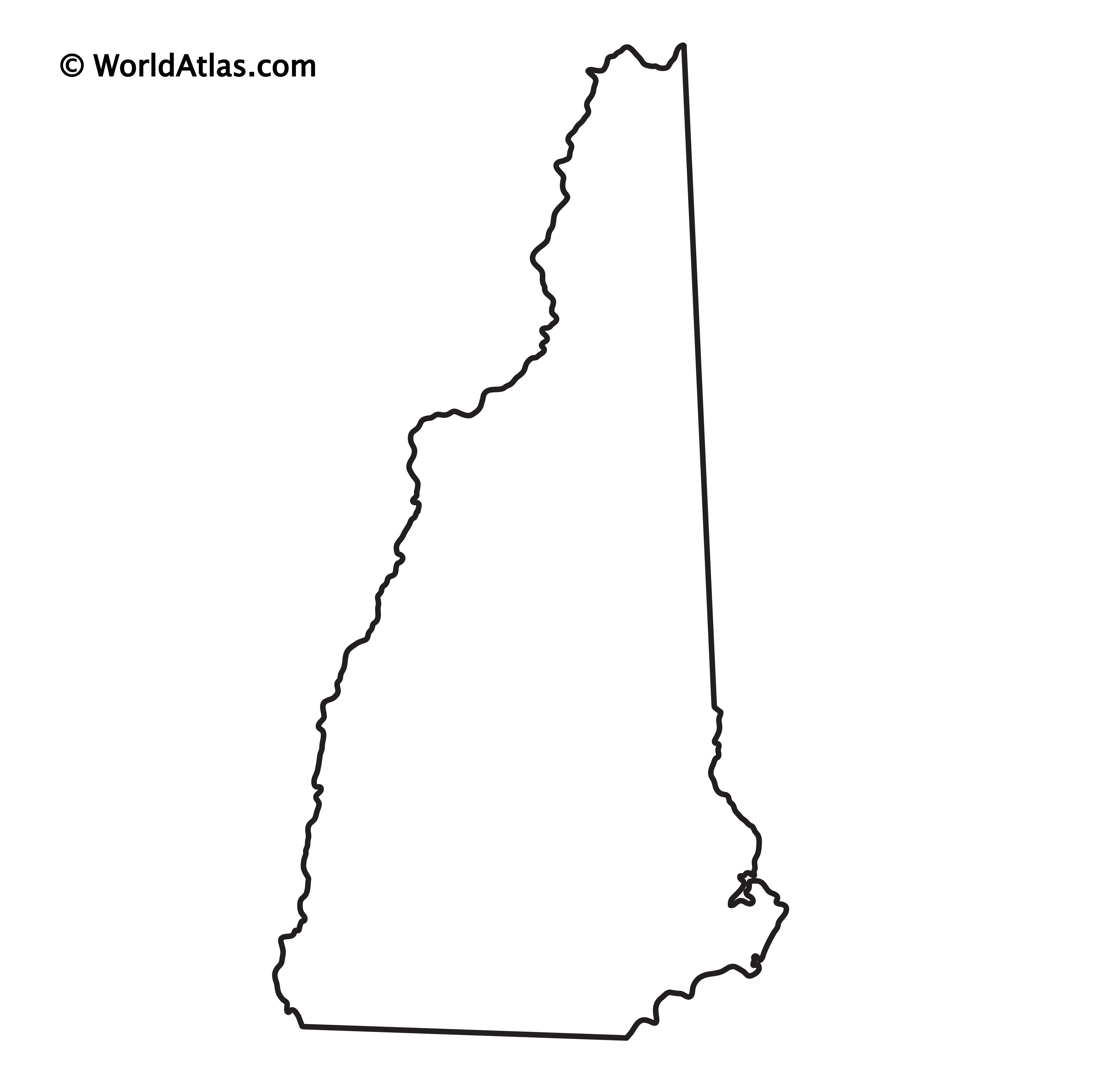
I was just thinking the same thing. . .
AND THAT IS OBVIOUSLY WYOMING. Trick question.
You would be surprised that half the country doesn't know what the shape of MS looks like. It is a mirror image of AL and I promise you most of the country doesn't get it.
Pop quiz...is this Vermont or New Hampshire?
AND THAT IS OBVIOUSLY WYOMING. Trick question.