Hey dumbass, user name is literally crying about a logo.

Last edited:
Hey dumbass, user name is literally crying about a logo.
Actually the "Croom" era Banner M was in the middle of the Hump floor & on the leg of the basketball shorts the year the men went to the Final Four in 1996. I really don't understand the Banner M hate. We only went to 13 straight bowl games with the Banner M primarily worn on the football helmet. Banner M also saw Women's Basketball go to 2 Final Fours & Softball to its 1st Super Regional ever. I've said before that I have no issues with script State on a basketball, baseball, or softball jerseys. On a polo or pullover its ok, but it looks soft, effeminate, & impotent on a football helmet.So you gonna call my take stupid and then revise history? We were interocking MSU during men's final four.
Yes, get rid of the STUPID looking Croom error banner M. GOOD RIDDANCE
Before y'all throw a parade, the Banner-M will continue to be the University logo. So, please don't go all Three Year Letterman when you see it everywhere on campus this fall.
For me, it's not emotional. However, the branding at MSU has been at a disappointing level of inconsistency for decades. This makes it a deficiency and a weakness.What upsets you about the changing of the logo?
Our football players should just wear their high school logos since that’s who they’ll claim in the NFL.
Selmon cares because it's branding & marketing. Perhaps two of the most important functions of a cohesive Athletic Department.We already were.
If it's just a logo, then why does Selmon care so much about it?
To be fair, you don't seem to have much brain power to spare....Understand, and that's probably the bigger problem. Our fans are stupid and don't know what's best for Mississippi State. Like I said, I've given up, no more of my brain power or energy will be spent towards trying to gospelize MSU. It's simply sports entertainment for me at this time.
The '96 men's basketball team wore the "Ribbon M" just like Croom's football teams. The "Banner M" was introduced under Byrne and first worn by Mullen's teams.You're wrong. The MState was at mid court and the 95-96 wore MState on the uniform. They were the first team to wear it
THIS!!!For the life of me, I cannot figure out the 'why' behind the official change. Sell as much merch as you want, who cares. But one thing isn't debatable - banner MState looks better on the football field, basketball court and on the side of DWS than &tate.
And there are obvious advantages to using the official university logo throughout athletic endeavors. There are tons of ways to change things up, without the main logo. It's all just so unnecessary. Put whatever you want on uniforms, who cares. But keep that one level of consistency. The one place it's not needed is baseball, where the M over S has its own brand and no one questions it. Funny that nobody looks to that successful example - nope, we gotsta just keep changin' shlt
THIS, THIS, A THOUSAND TIMES THIS!!!As someone who is not from Mississippi and has never lived in Mississippi besides my four years in Starkville, no one outside of State fans are going to have any clue what school this is. Besides thinking of the Dr. Pepper commercials that run during college football season. If that's the space they want to pigeon hole themselves into, they've done it. I could where a t-shirt with State on it in the city I live in with 5 million people this weekend and the only people that would realize what school that is would be an alum.
You’re an idiot. Selmon is going to do great things for the university.We found some success selling merch. Congrats Selmon. And congrats Keenum for hiring the clown. At least now it's in plain sight that it was Selmon and his supporters who wanted this, not Cohen. Obviously that decree was coming from Keenum at some level.
Whatever, man, ya'll can have it. MSU is in my blood but my support and care level is way down. We just continuously do this stuff to ourselves, and have no idea what's out there in the world.
Same with his football hire. A buddy assistant from his old school. May work out may not. Point being, nothing new or creative. Easy way out.Because he dug up logos from decades ago?
If he wants to rebrand he should come up with something new and creative. He didn't.
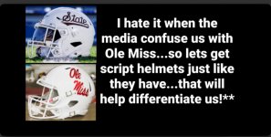
Script State still looks like a knock off ole miss logo to me
Yeah man. He also hired the next Joe Moorhead. Can’t wait.You’re an idiot. Selmon is going to do great things for the university.
I never bought anything with banner M on it. Can’t stand it.For the life of me, I cannot figure out the 'why' behind the official change. Sell as much merch as you want, who cares. But one thing isn't debatable - banner MState looks better on the football field, basketball court and on the side of DWS than &tate.
And there are obvious advantages to using the official university logo throughout athletic endeavors. There are tons of ways to change things up, without the main logo. It's all just so unnecessary. Put whatever you want on uniforms, who cares. But keep that one level of consistency. The one place it's not needed is baseball, where the M over S has its own brand and no one questions it. Funny that nobody looks to that successful example - nope, we gotsta just keep changin' shlt

