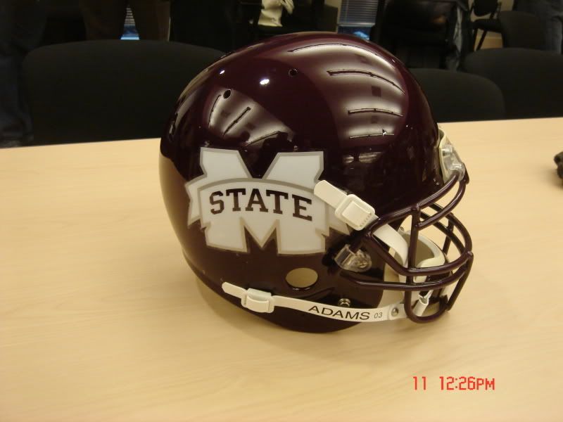
I thought the idea of the logo redesign was to help make Mississippi State a more recognizable entity. How is using a "washed out" M State going to help that? To the person that is non-familiar with MSU, they will not know what that logo is. This seems to be almost as bad an idea as the Ole Miss blob as it will only be a recognizable symbol to the fan base and those in the region.
</p>
</p>