Help with Helmet... Here it is
- Thread starter Xartox
- Start date
You are using an out of date browser. It may not display this or other websites correctly.
You should upgrade or use an alternative browser.
You should upgrade or use an alternative browser.
- Status
- Not open for further replies.
Looks sort of like a bat.
Better than what we had, not what I want, but at least it's respectable.
I want to see what the whole uniform looks like before I pass judgement.
Better than what we had, not what I want, but at least it's respectable.
I want to see what the whole uniform looks like before I pass judgement.
Man....
I'm gonna be honest with you, compared to the white ones with that gay *** racing stripe on them, those are a LEAP better.
I'm gonna be honest with you, compared to the white ones with that gay *** racing stripe on them, those are a LEAP better.
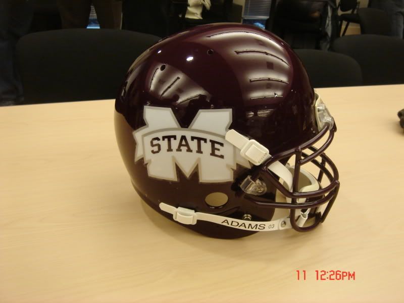
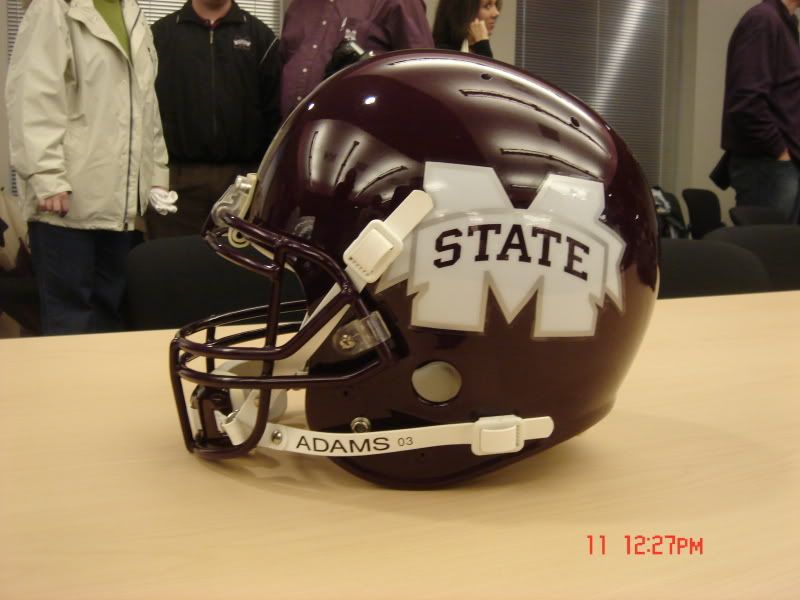
Love the dark maroon, like the bit of silver...the new M-State logo=doodoo. That is a bad, bad-looking piece of design work. We need our money back on that one.
") ive heard there will be silver in the uniforms also
ive heard there will be silver in the uniforms alsoThe other MSTATE logo looked much better on the helmets. This logo runs into the chin strap so that you can't even really see it. I don't know what you people are smoking, but these look terrible compared to the old MsState logo. Doesn't anybody else see what I am looking at??

Maroon Helemt = Good. Mstate = Ugly as 17!!. Nevertheless, this is still better than what we had, but I really hope this is NOT the final product. Also, I will hold my judgement until I see how the rest of the uniform pans out.
growing on me in just a few short hours....Looking at what Adidas has to offer as a uniform, I think it will look great any of you photoshoppers out there that can put together this helmet with the adidas uniforms they show on their website?

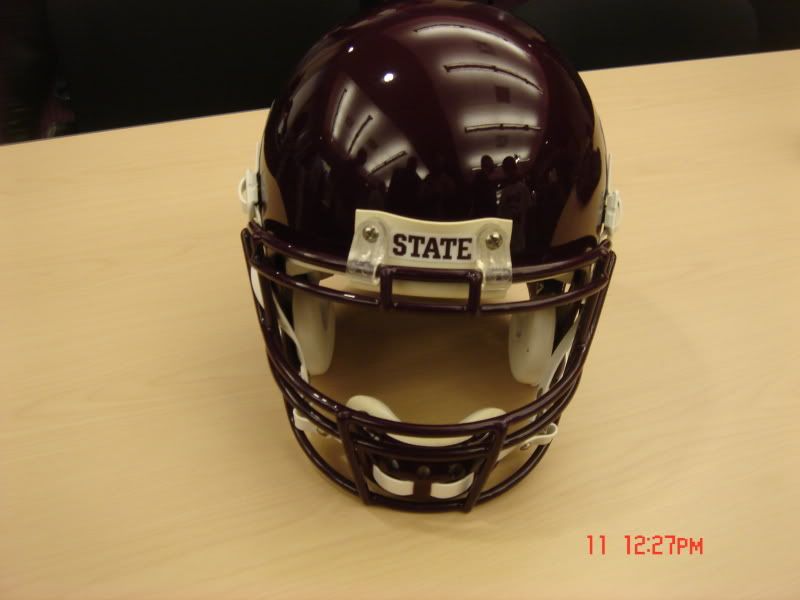
that stands out to me is you can actually read STATE on the helmet. Maybe this would help with those who want to call us Mississippi only.
is it just me or r the new helmets the ugliest helmets in the ncaa i think the logo aint great personally. im tired of state changing logos and uniforms everytime we get a new coach!
- Status
- Not open for further replies.