Help with Helmet... Here it is
- Thread starter Xartox
- Start date
You are using an out of date browser. It may not display this or other websites correctly.
You should upgrade or use an alternative browser.
You should upgrade or use an alternative browser.
- Status
- Not open for further replies.

while I am /was a big fan of the inter-locking MSU, I can live w/ this.
I don't know how to explain it, but I understand w/ the banner line is not under the "STATE", possibly, I don't know, but none of the other "M" logo schools are doing it this way, & it allows a more modern appearance.
The silver outline makes me think the silver pants are coming back, & we will have a more"dressed up" jersey reminiscent of the "Miss. State" jerseys.
This logo seems to lend itself well to color changes.
I really like the more modern appearance
& think it would be cool for the bulldog head to exist dead center of the back of the helmet, right above the neck-line.
</p>
to your rivals in the north. I just hope he doesn't do the solid maroon uni's like they do at UF on occasion.
on the inside of the silver lines. I think that would make it stand out even more. just a very thin maroon line on the inner edge of all the silver would be good.
for the most part, they are for individual achievement
We need to develop the "Team" concept right now
I am sure Ohio State has rewarded achievement decals to the entire offensive line for, i.e., perfect pass protection on a particular play, it is still a break from the "win as a team, lose as a team" concept.
I say let them & Georgia have it
We need to develop the "Team" concept right now
I am sure Ohio State has rewarded achievement decals to the entire offensive line for, i.e., perfect pass protection on a particular play, it is still a break from the "win as a team, lose as a team" concept.
I say let them & Georgia have it
See how much more it would stand out. Obviously the finished product would be a lot cleaner.
 I took us all of 2 minutes to improve upon the university's design....sheesh.

The gray outline might look nice on apparel, but it will get lost at a distance. It will look like a white blob from the stands.
In a different font and worked up a bit...again, not a photoshop pro and i had like 3 fonts to choose from.
I just really don't like the MState banner...i'm trying to get used to it and I just can't.
Plus, there would be no confusion between State and Ole Miss anymore. With these new logos the predominant thing you notice is the giant M.</p>
I just really don't like the MState banner...i'm trying to get used to it and I just can't.
Plus, there would be no confusion between State and Ole Miss anymore. With these new logos the predominant thing you notice is the giant M.</p>
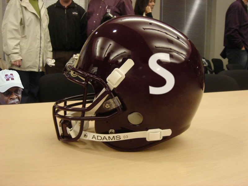
I do think there needs to be more inphesis on the MState but overall I do like the maroon on the helmet and facemask...any idea how much we would have to pay in order to get the interlocking back from Nike? I would also suggest positioning the logo differently on the helmet it looks kinda awkward to me...
jmbeck wrote:
Winning fixes everything.
I agree that the logo design needs some work, especially since it is partially hidden behind the chinstraps, but like jmbeck put it, winning will turn that C-USA logo into something everyone will magically grow to like.
& I think that is fine if it is lost at a distance, we are often known & referred to as "State", so let that be the prominent figure on the logo, seeing every line of the "M" is not that important.it will get lost at a distance. It will look like a white blob from the stands.
I think that the key here is that it is a more modern & progressive logo that will have appeal on apparel, & quite frankly, I think the combination of the whole uniform will turn out great.
If you think about it for a minute, you will probably realize that the monotony of the old uniforms were exasperated by the fact that the decal on the helmet was so detailed, plain uniforms w/ a very detailed but stiff & institutional logo, it looked good on paper but didn't belong on a helmet
We may never get the inter-locking MSU back, but the modern feel of this MState is good, & in no way reminds me of the previous 5 years of football
Seeing the helmet today makes me think that our new uniforms will be of a Virginia Tech (first team I thought of ) style.
Remember something... this piece of junk logo is not just going on our helmet, nor is it done by the athletic department, but will now be the NEW Univeristy-wide logo. That means that everywhere we go, in all stores and on all clothes, that cheap *** looking thing is going to be what represents us. Now, go compare it to every other SEC school logo, or ANY Division I school for that matter, and see if it doesn't make you want to punch Doc Foglesong in the face. This is PATHETIC.
S
shotbnkri
Guest
What happened to the M-S-U diagonal design seen in the 80's with the thicker letters? I loved that logo, and while they did interlock, Nike did not own the rights to it. Let's bring that back!
definitely needs better outlining on the M-state, you can hardly tell where the overlapping is what happened to the bottom half of the ribbon?
it is better but not by a whole lot.
maroon helmet will help though
what about black jerseys? or pants? or both
it is better but not by a whole lot.
maroon helmet will help though
what about black jerseys? or pants? or both
U
UnprepentantLieutenant.nafoom
Guest
It's "interlocking" but not like the three-tiered design that used to be on the helmet. That would look cool.
That said, the color and facemask look really cool.
Somebody said it earlier, but it's the banner that makes it look ghey. Just get rid of the banner and have STATE in block letters across the solid M.
Much better than the last five years, though.
Somebody said it earlier, but it's the banner that makes it look ghey. Just get rid of the banner and have STATE in block letters across the solid M.
Much better than the last five years, though.


- Status
- Not open for further replies.