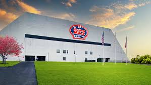
SIAP, but I still wish it were called Jersey Mike's RAC, but it's at least nice to see a new sign up...

Sorry, but they're not going to screw with their logo for that...I think if it’s here on the internet it’s public record and I will get some kickback $$ down the road
The R in jeRsey mikes should be the Rutgers R
Looks fine to me - what were you looking for?That looks atrocious.
Sure does. Very cheap looking. Feels like it’s in a mini-mall.That looks atrocious.
Looks fine to me - what were you looking for?
Sorry, but they're not going to screw with their logo for that...
 You know Jersey Mike's wants us to hurry up and renovate bad
The problem is that anything new on the facade just highlights how bad the building looks. So glad renovations are on the way. This is truly lipstick on a pig, but I get it. It's more about branding for our corporate sponsor and less about trying to make the RAC look better. The renovations will take care of that.Sure does. Very cheap looking. Feels like it’s in a mini-mall.
 .
.
Not calling it Jersey Mikes RAC is a miss because it’s so often referred to as the “The RAC” at least when people say on TV “here at Jersey Mikes RAC” they are associating themselves with the more popular phrase. “Arena” is not associative.SIAP, but I still wish it were called Jersey Mike's RAC, but it's at least nice to see a new sign up...
Not complaining, I really don't care. They can do whatever they want to the exterior. Just pointing out it looks terrible.What a bunch of Petty Complainers. Lol,
It's the Jersey Mike's logo. There is no option to change their logo, change the color or put it in a different font or script.
We could always petition Jerseys Mike to change their Company Logo., lolNot complaining, I really don't care. They can do whatever they want to the exterior. Just pointing out it looks terrible.

It's not about the logo itself. It just looks cheap and out of place thereWe could always petition Jerseys Mike to change their Company Logo., lol
Looks like the anchor tenant for a strip mall. A vape and a tattoo shop will fill in either end.It's not about the logo itself. It just looks cheap and out of place there
Simple and effective.I’ll steal the idea and money.
Make the r in arena the block R.

Your idea is being used on the ground level by the doors...Maybe there's structural considerations that made it impossible but some version of this sign maybe? With "Arena" instead of Subs
one person and it wasn't even a complaint but a suggestion . The old crummy roof is what makes it look cheap. We know it is temporary but can't we admit it doesn't look anywhere as nice as this ?What a bunch of Petty Complainers. Lol,
It's the Jersey Mike's logo. There is no option to change their logo, change the color or put it in a different font or script.
Yeah. Would look a little high-techy at least.Have asked before......why not have solar panels on that roof?
That sign is already on the parking lot side of the arena.Maybe there's structural considerations that made it impossible but some version of this sign maybe? With "Arena" instead of Subs
It does and I love itThat looks atrocious.
I agree that it’s mainly the roof that makes the new sign look bad. Doesn’t look like a surface that you would put a sign on.one person and it wasn't even a complaint but a suggestion . The old crummy roof is what makes it look cheap. We know it is temporary but can't we admit it doesn't look anywhere as nice as this ?
Those ARE solar panels. They're the original 1977 version. Things have come a LOOOONG way lol. (at least that's what I tell my friends who comment on the roof)Have asked before......why not have solar panels on that roof?

or at least a big blue oval like the logo has.Couldn’t they have at least sprayed the ugly brown roofing red before putting the sign on? That would’ve looked pretty good and prob could’ve been done in like 2 days.
If they called it the Jersey Mikes RAC everyone would just call it the RAC. Do you know what the real name of Indiana's Assembly Hall is? It isn't just Assembly Hall.Not calling it Jersey Mikes RAC is a miss because it’s so often referred to as the “The RAC” at least when people say on TV “here at Jersey Mikes RAC” they are associating themselves with the more popular phrase. “Arena” is not associative.

