How to reconcile the Banner M and Script logo
- Thread starter Clark Griswold.sixpack
- Start date
You are using an out of date browser. It may not display this or other websites correctly.
You should upgrade or use an alternative browser.
You should upgrade or use an alternative browser.


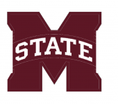
Looks like a softball uniform logo.
Clark what about it in a maroon State of MS similar to the one TAMU has with Texas?
Too centered. Push "State" to the left about 17 pixels.
I like where your head is at, but that does look like a Softball uniform. Great effort, and as a designer you do have to postulate what something could be, put it on paper, and realize that it has now been seen by the world.

The issue I have, the M is the problem, not what is written over it. It just isn't as good as basically anything else without the giant M behind it.
Yeah, and they were damn smart enough to bury that quickly.
Also, can we get rid of the mandatory 30 seconds between post? Sometimes a conversation needs to happen faster.
Clark what about it in a maroon State of MS similar to the one TAMU has with Texas?

Last edited:
Too centered. Push "State" to the left about 17 pixels.

Last edited:

Promising. I'm team script state. Use of the state logo might be necessary to win over the folks that can't get over two other programs branding as such despite those being different regions and colors. This is too busy for the helmet, but jerseys, hats, and other merchandise would be a solid logo. Nice work.
Right. It becomes too much with the M. Simple is the key.The issue I have, the M is the problem, not what is written over it. It just isn't as good as basically anything else without the giant M behind it.
That said, script State over the state of Mississippi logo is growing on me.
I like the idea of the m-state with block letters. I just think the banner is too much. What about an m-state without the banner? I just did this in blue beam but maybe someone else could do better a job with it.
Attachments
-
 1BB078F1-8A3E-45AD-A738-B0C5BF58AB4D.png55.3 KB · Views: 4
AgreedRight. It becomes too much with the M. Simple is the key.
That said, script State over the state of Mississippi logo is growing on me.

The best hat/helmet letter logos we have had is the M over S and the Nike interlocking MSU. With that said as proven by this post string no logo is gonna please everyone. It's all about Merch; so the more logos we have allows for more merch that more people can find something they like. For graphic logos I am partial to swinging bully and I like our current Bulldog Head on the helmet.


Perfect alternate logo to accent the script. Would look perfect on fan gear.
Th
Those shoes don't go with that dress.
I might would take offense to that if it weren't so true.Looks like a softball uniform logo.
My humble suggestion would be to eliminate the grey outline beyond the block-M. Quick and dirty in Paint, so please excuse the crudity...

"Script State" = Clef tate A band logo.
Nike skinny MSU is just terrible. However State fans will never be happy until it is brought back for some reason. So if they would tweak the 80s MSJ. So the U is slightly more visible and looks like MSU... maybe that would suffice.
if the baseball AD and baseball school went with a baseball logo.... then you would need to tweak it and make it larger for a football helmet, see UNCs typical helmet. The way it was presented last year looked horrible. A white blob.
Here’s my thing with the interlocking MSU: we rarely refer to ourselves as MSU. It’s State."Script State" = Clef tate A band logo.
Nike skinny MSU is just terrible. However State fans will never be happy until it is brought back for some reason. So if they would tweak the 80s MSJ. So the U is slightly more visible and looks like MSU... maybe that would suffice.
if the baseball AD and baseball school went with a baseball logo.... then you would need to tweak it and make it larger for a football helmet, see UNCs typical helmet. The way it was presented last year looked horrible. A white blob.
No "M", no banner. I'm not opposed to script State but very partial to the M over S as my favorite
That looks good. A regular S better.
However that &tate is recognized under the University branding currently. Script with a regular S, is not.
I think the Script looks good for baseball but not football. The M-STATE without the "M" would look good IMO.
Better get an IP attorney and file fast
Aww, hell no! Akin to wearing vertical-striped shirts with horizontal pants. Just does not go together at all, IMO.
All of these logos are money!!The best hat/helmet letter logos we have had is the M over S and the Nike interlocking MSU. With that said as proven by this post string no logo is gonna please everyone. It's all about Merch; so the more logos we have allows for more merch that more people can find something they like. For graphic logos I am partial to swinging bully and I like our current Bulldog Head on the helmet.
View attachment 246766View attachment 246768
View attachment 246769View attachment 246771
Get rid of all that damn gray once and for all.
Why can’t Adidas just recreate the interlocking MSU a few pixels wider or just different enough to avoid violating copyright?The best hat/helmet letter logos we have had is the M over S and the Nike interlocking MSU. With that said as proven by this post string no logo is gonna please everyone. It's all about Merch; so the more logos we have allows for more merch that more people can find something they like. For graphic logos I am partial to swinging bully and I like our current Bulldog Head on the helmet.
View attachment 246766View attachment 246768
View attachment 246769View attachment 246771
Loved last year’s baseball logo MS, but it needs to be scaled up on the helmet to be seen on TV. Like UNC’s logo.
I really like the swinging bulldog, the only thing that irritates me about that logo is that his hands are backwards. The wrong hand is on top.The best hat/helmet letter logos we have had is the M over S and the Nike interlocking MSU. With that said as proven by this post string no logo is gonna please everyone. It's all about Merch; so the more logos we have allows for more merch that more people can find something they like. For graphic logos I am partial to swinging bully and I like our current Bulldog Head on the helmet.
View attachment 246766View attachment 246768
View attachment 246769View attachment 246771
This is Bart Simpson’s State.
I had that issue when I moved to Texas. Everyone kept having to ask me, "What State"?Here’s my thing with the interlocking MSU: we rarely refer to ourselves as MSU. It’s State.
I still say State among us Missippi' people.