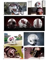
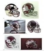
Logo Poll
- Thread starter Puppers
- Start date
You are using an out of date browser. It may not display this or other websites correctly.
You should upgrade or use an alternative browser.
You should upgrade or use an alternative browser.
My top 3
M over S
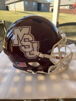
Interlocking MSU
Script State
M over S
Interlocking MSU
Script State
45-2 lol. Literally no matter where you do a poll: SPS, 247, or Twitter our current logo gets murdered. Only our athletic department would think that's fine.
Last edited:
I voted for the script State but I like the banner M. The interlocking MSU is my least favorite and that’s somewhat surprising because that’s the logo of my time at State. To me the interlocking MSU blurs together at game distance and frankly looks high schoolish. The M over S needs to stay as a baseball only logo, maybe put it on the football helmet once a year or every other year. I realize I’m in the minority.@DesotoCountyDawg - you like the M-State banner?
Voted for script, but really like the Flying M as well. I’d be happy with anything except our current logo
Banner M is my least favorite. Bottom line is just pick ONE and use is for all sports. It’s hard to be good at branding when we can’t even figure out who we are, much less the rest of the Country. Part of which can’t even separate State from UM. One logo for football, one for basketball, one for baseball, etc,etc,etc. not a good branding strategy.
Interlocking MSU>Script State>M over S
the others suck. I don’t understand the flying M or how it was ever our logo. It’s somewhat cool now bc it is old, but, what a weird logo. The banner M has, and always will, suck.
I would be very happy with a change to the script state.
the others suck. I don’t understand the flying M or how it was ever our logo. It’s somewhat cool now bc it is old, but, what a weird logo. The banner M has, and always will, suck.
I would be very happy with a change to the script state.
Wish there were a way to do the baseball MS bigger like how UNC's looks. The baseball logo football helmet was fantastic, but the logo wasn't big enough to be visible from a distance. Chillbilly had some great mockups back in 2020 or so.
The great thing about Adidas is they ARE embracing with enthusiasm making us the Oregon of the SEC. So the challenge is figuring out who has the hotline to their design department, and either bribing him or kidnapping him until they do what we want.
The great thing about Adidas is they ARE embracing with enthusiasm making us the Oregon of the SEC. So the challenge is figuring out who has the hotline to their design department, and either bribing him or kidnapping him until they do what we want.
Make script the primary. As a graphic designer it’s my favorite by far. It’s unique, sleek, and classic. And I love the idea of finally branding ourselves as “State.”
Btw the interlocking MSJ is never coming back.
Btw the interlocking MSJ is never coming back.
I voted for it. Dont love it but we need some consistency and it highlights the word State furthering that branding process.@DesotoCountyDawg - you like the M-State banner?
Put script State on the chest and get rid of the God awful word mark on there now. That thing is the worst logo in college sports
The problem with the script State is that I think it would be damn near impossible to trademark.
The script state with the outline of Mississippi in the "a" someone posted on here I think you could trademark easily
93% of us do not like the banner M. When is the last time 93% of us miserable 17s agreed on anything?
Not often. Stinky cups and banner M.93% of us do not like the banner M. When is the last time 93% of us miserable 17s agreed on anything?
Very few people like it.
I voted for the script State but I like the banner M. The interlocking MSU is my least favorite and that’s somewhat surprising because that’s the logo of my time at State. To me the interlocking MSU blurs together at game distance and frankly looks high schoolish. The M over S needs to stay as a baseball only logo, maybe put it on the football helmet once a year or every other year. I realize I’m in the minority.
This makes two of us. I don't hate the Banner M. It looks much better now that the curly scroll ends are gone.
I like the script State, but my issue with it is the other SEC school in our state has been using the script for a long time. I’d like to see a block State at some point for comparison.Make script the primary. As a graphic designer it’s my favorite by far. It’s unique, sleek, and classic. And I love the idea of finally branding ourselves as “State.”
Btw the interlocking MSJ is never coming back.
I don’t mind the banner M maybe because I’ve become used to it. I can’t stand the interlocking - to me it looks low rent or as another poster stated, “high schoolish”.
As a usc Trojan and msu Bulldog
Love script State, and certainly like the idea of 'State' being our primary marketing phrase. But I also like switching up helmets and uniforms. I mean we have no real tradition, so I say go Oregon with it.
With me it was a toss up between the flying M and script State. I went with the flying M because I've always liked it, and it is currently relevant to our offensive scheme. On down the road, it may not be. If we were a ground and pound team, I'd have gone with the script State.
Since we're a such a negative bunch, maybe we should have another poll of what is the one we've had on the helmets that we don't ever want to see there again.
Since we're a such a negative bunch, maybe we should have another poll of what is the one we've had on the helmets that we don't ever want to see there again.
Gotta be the "snow bowl reunion" helmet right?Since we're a such a negative bunch, maybe we should have another poll of what is the one we've had on the helmets that we don't ever want to see there again.
Banner M is my least favorite. Bottom line is just pick ONE and use is for all sports. It’s hard to be good at branding when we can’t even figure out who we are, much less the rest of the Country.
Mississippi State did pick a logo in 2009 and launched branding. The University has figured it out. Everyone knows who the MState logo represents. Final 4s, Dak, #1, National Championship appearances ...... but whatever.
A handful of loud State fans can't be happy. Complain about everything from the University branding to Starkville and all in between. Just burn it down with Clef tate.
edit to add: baseball needs to always wear MoverS. Football... have some one off helmets if people want.
Part of it for me at least is the idea of branding ourselves as State. It’s been in our history the whole time.I'm surprised script state is winning this compared to interlocking msu. Interlocking msu to me is the most notable recognizable msu helmet. Script msu is more of a baseball thing I feel like
Look at word is emphasized in the 85 logo.

Look at one of our most iconic photos.
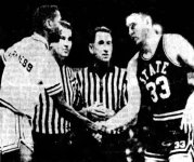
Wanting things to be better isn't complaining. This poll was just to get an idea of what people liked. If the majority of our fans don't like something why should it be our primary logo?Mississippi State did pick a logo in 2009 and launched branding. The University has figured it out. Everyone knows who the MState logo represents. Final 4s, Dak, #1, National Championship appearances ...... but whatever.
A handful of loud State fans can't be happy. Complain about everything from the University branding to Starkville and all in between. Just burn it down with Clif tate.
edit to add: baseball needs to always wear MoverS. Football... have some one off helmets if people want.
Only at Mississippi State do the fans hate their own things.Wanting things to be better isn't complaining. This poll was just to get an idea of what people liked. If the majority of our fans don't like something why should it be our primary logo?
And Carolina Pride hotdogsNot often. Stinky cups and banner M.
Very few people like it.
So we should just like anything and everything the university does? I don't get the logic.Only at Mississippi State do the fans hate their own things.
It's not like we are boycotting the team or anything. People are allowed to have different opinions.
The Flying M was a tribute to our Aero Eng program during the Apollo program.Interlocking MSU>Script State>M over S
the others suck. I don’t understand the flying M or how it was ever our logo. It’s somewhat cool now bc it is old, but, what a weird logo. The banner M has, and always will, suck.
I would be very happy with a change to the script state.
I can see that I guess the script to me doesn't look as good in football as compared to baseball. I prefer block lettering in footballPart of it for me at least is the idea of branding ourselves as State. It’s been in our history the whole time.
Look at word is emphasized in the 85 logo.
View attachment 246625
Look at one of our most iconic photos.
View attachment 246626
Bryan's juicy jumbos then the downgrade to Carolina then picky people pick polks. Now the best country pleasin. Pride of Florence and orginally pelahatchie. Well north of there anyways.And Carolina Pride hotdogs
Of the choices that were available, I voted for the script State. I reserve the right to change my mind if it doesn't look as good on the field as it does in the pictures.
There's a theory that your favorite team's uniform is the one you remember from the time you first started liking them. For me that's the John Bond-era uniforms, which weren't part of the poll.
There's a theory that your favorite team's uniform is the one you remember from the time you first started liking them. For me that's the John Bond-era uniforms, which weren't part of the poll.
This. 100% this. Everyone worries about switching things and it making us hard to identify. I would argue the opposite. Having a different uniform every week is literally Oregon’s identity, and I would say it has worked pretty well for them. I’m not saying i want highlighter yellow uniforms, but I do think we should take full advantage of what Adidas is trying to do And embrace the chaos a bit.Love script State, and certainly like the idea of 'State' being our primary marketing phrase. But I also like switching up helmets and uniforms. I mean we have no real tradition, so I say go Oregon with it.
I like the Banner M (I've always called it the M State logo) we currently use. I didn't like the version we used in the late 90s/early 2000s but I've always thought the refresh they did on it 12-15 or whatever years ago looked really good. I honestly don't understand why people hate it so much.
