2025 Uniformity – Special Edition: Sun Devils Reveal New Standard Uniforms
New Standard Uniforms for Sun Devils
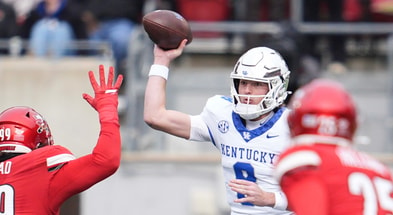
The Sun Devils just revealed their new “Strategy” template standard uniforms, which bring an updated jersey that harkens to a more traditional style. This replaces the previous template, which had a short two-year run. That uniform set, aside from a welcomed return of white outlined numbers on the maroon jersey, was largely underwhelming. For reference, here are the departing home and away uniforms seen below:
That template, which was worn during the 2023 and 2024 seasons, eliminated the sublimated state flag on the chest and “ASU” on the back collar that its predecessor featured from 2018-2022, leaving no true team identifier on the jersey. That is not an issue with this newly revealed uniform. The team colors and identifiers take center stage. I was able to gain exclusive access to get close-up shots of all the details, so let’s dive in.
Updated Home and Away Jerseys
Let’s first take a look at the new maroon home jersey.
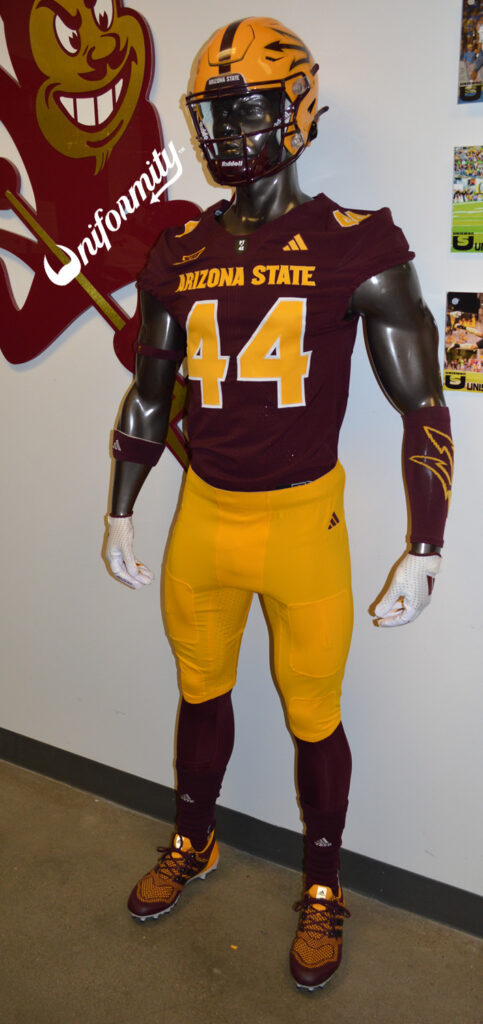
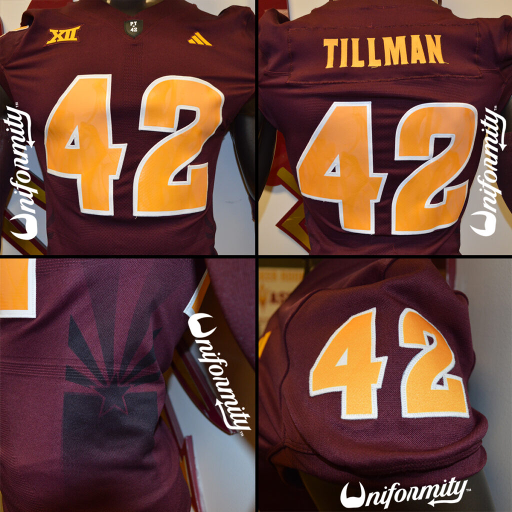
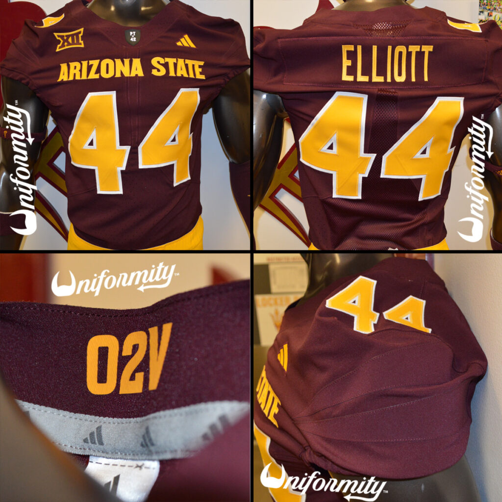
The primary change to the new generation of jerseys is the addition of the team name to the front of the jersey. The maroon jerseys feature gold “Arizona State” print in Sun Devil Bold font across the chest, gold player numbers outlined in white on both the front and back of the jersey, as well as the TV numbers on the sleeves. The sleeves also feature angular maroon fabric accents reminiscent of the rays on the Arizona state flag. Another welcome change to this generation of jerseys compared to the prior is that the jersey numbers are fabric rather than print. The numbers on the new jersey also appear to have a larger vertical format than last season.
The nameplate on the back of the jersey utilizes the gold plain text font reminiscent of previous generations of uniforms, particularly from 2011-2014. On the front of the jersey, near the left shoulder, is a gold adidas logo. Near the right shoulder is a maroon and gold Big 12 logo. There is also a gold O2V printed on the inside of the collar, harkening to the final lyrics to the Arizona State fight song, “Onward to Victory.” Last, but not least, at the base of the collar is the black PT*42 shield in honor of ASU Football legend, Pat Tillman.
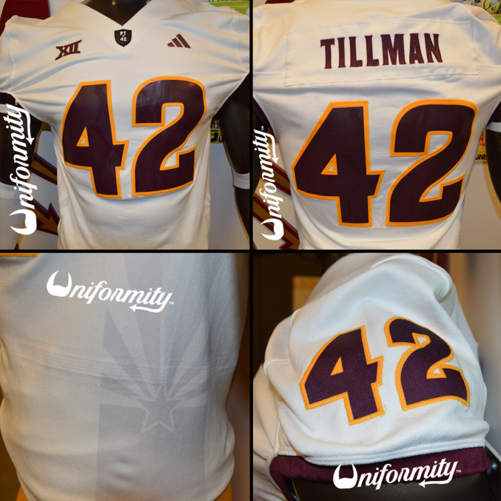
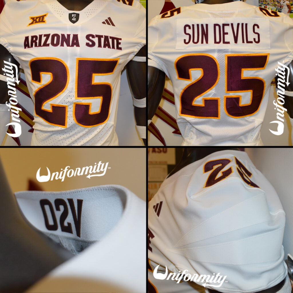
Next, let’s go over the new away white jersey.
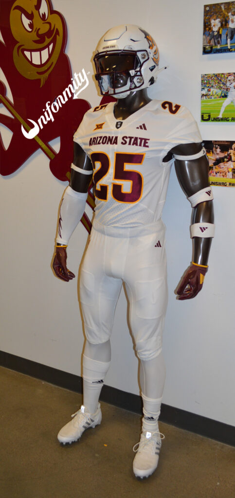
The white jerseys feature maroon “Arizona State” print in Sun Devil Bold font across the chest, maroon player numbers outlined in gold on both the front and back of the jersey, as well as the TV numbers on the sleeves. Much like the maroon jersey, the sleeves also feature angular white fabric accents that represent the rays of the Arizona State flag. The white jersey also features fabric numbers, which appear to have a larger vertical format than last season’s jersey.
The nameplate on the back of the jersey utilizes the maroon plain text font. On the front of the jersey, near the left shoulder, is a gold adidas logo. Near the right shoulder is a maroon and gold Big 12 logo. There is also a maroon O2V printed on the inside of the collar, and, as always, at the base of the collar is the black PT*42 shield.
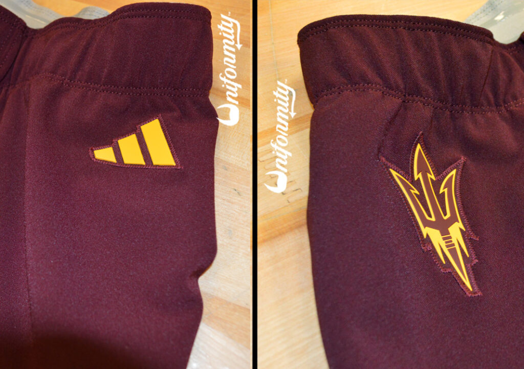
Updated Pants
The pants have been refreshed as well, and they’ve reverted back to a more simplified look. Gone is the large, attention-grabbing pitchfork on the right thigh. For reference, here is what the 2023 and 2024 pants looked like.
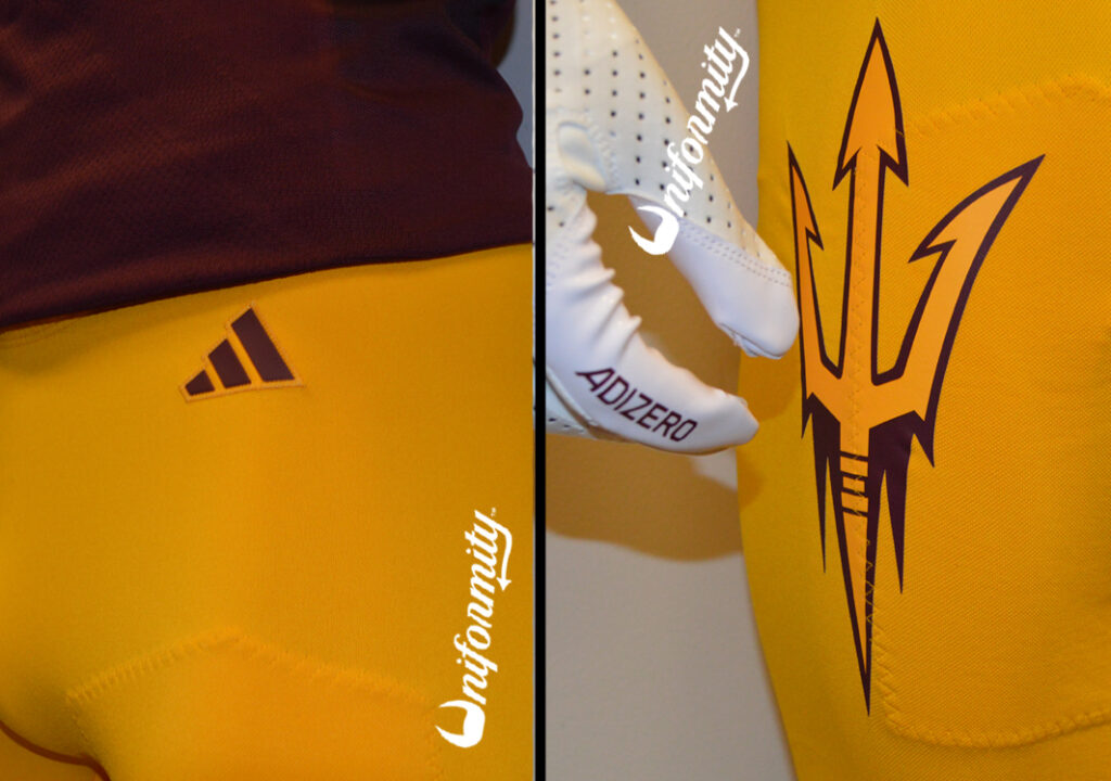
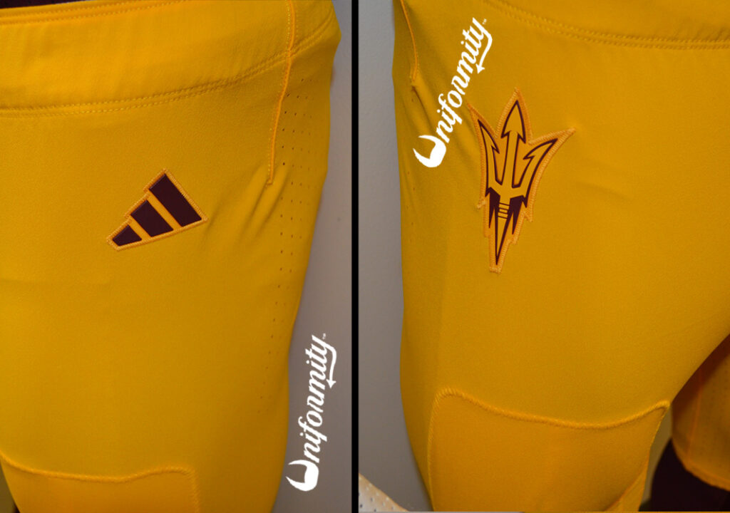
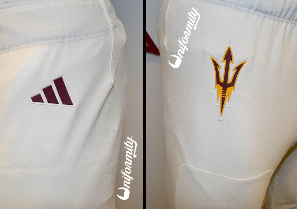
All three of the new pants follow the same template, with the only difference between them coming from the color of the pants and their coordinating logos.
The gold pants have a maroon adidas logo on the left hip and a gold pitchfork with maroon trim on the right hip.
The white pants have a maroon adidas logo on the left hip and a maroon pitchfork with gold trim on the right hip.
The maroon pants have a gold adidas logo on the left hip and a maroon pitchfork with gold trim on the right hip.
Reaction
Although the changes are subtle, this feels like a massive upgrade. Returning the team name to the front of the jersey is long overdue, as it has been missing from the jersey’s chest since 2018. The plain-text nameplate on the back of the jersey is also a bit of a throwback. With these updates, there is more color contrast to highlight Arizona State’s incredible maroon and gold primary colorway. Simplifying the pant design and making it a bit less busy is also a win. Traditionally, ASU’s best-looking uniforms have had very basic pants with the team logo on the hip. As ASU Athletic Director Graham Rossini and the Sun Devil social media messaging about these uniforms have said, these uniforms are where tradition meets transformation. They satisfy the traditional look that Arizona State has always looked best in, while keeping up with the modern era of college football uniforms. This ought to be a fun season for Uniformity.